- Published on
6 Ideas To Help You Build A Toggle button With Tailwind CSS Like A Pro
- What is Tailwind CSS?
- The Description of Toggle Button UI Component
- Why Use Tailwind CSS to Create a Toggle Button UI Component?
- The Preview of Toggle Button UI Component
- The Source Code of Toggle Button UI Component
- How to Create a Toggle Button with Tailwind CSS?
- 1. Use the bg-gray-300 class to set the background color of the button
- 2. Use the hover:bg-gray-400 class to add a hover effect to the button
- 3. Use the rounded-full class to create a circular button shape
- 4. Use the w-12 and h-6 classes to set the width and height of the button
- 5. Use the flex and items-center classes to center the toggle button content
- 6. Use the transform, transition-transform, and duration-300 classes to add an animation to the toggle button
- Conclusion
What is Tailwind CSS?
Tailwind CSS is a utility-first CSS framework that helps you create responsive and customizable user interfaces. It provides a set of pre-defined classes that you can use to style your HTML elements, without having to write any custom CSS. With Tailwind CSS, you can build complex UI components quickly and easily, without sacrificing design flexibility.
The Description of Toggle Button UI Component
A toggle button is a UI component that allows users to switch between two states, such as on/off, yes/no, or open/closed. It is a common UI element used in web and mobile applications, and can be used to trigger actions, change settings, or show/hide content.
Why Use Tailwind CSS to Create a Toggle Button UI Component?
Tailwind CSS is a great choice for building toggle buttons because it provides a wide range of utility classes that make it easy to create custom styles. With Tailwind CSS, you can easily change the size, color, and shape of your toggle button, as well as add animations and hover effects.
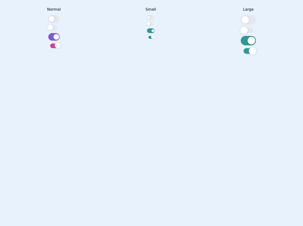
The Preview of Toggle Button UI Component
To create a toggle button with Tailwind CSS, you can use a combination of HTML and CSS classes. Here is an example of what a toggle button might look like:
<button class="bg-gray-300 hover:bg-gray-400 rounded-full w-12 h-6 flex items-center">
  <div class="bg-white w-4 h-4 rounded-full shadow-md transform transition-transform duration-300"></div>
</button>
Free download of the Toggle button's source code
The Source Code of Toggle Button UI Component
To create a toggle button with Tailwind CSS, you can use a combination of HTML and CSS classes. Here is an example of the source code for the toggle button previewed above:
<button class="bg-gray-300 hover:bg-gray-400 rounded-full w-12 h-6 flex items-center">
  <div class="bg-white w-4 h-4 rounded-full shadow-md transform transition-transform duration-300"></div>
</button>
<style>
  .shadow-toggle {
    box-shadow: 1px 0px 2px 1px rgba(0, 0, 0, 0.1), -1px 1px 4px 1px rgba(0, 0, 0, 0.06);
   }

  .left-4 {
    left: 4%;
  }

  .left-96 {
    left: 96%
  }
</style>

<div class="p-5">
    <div class="flex flex-col md:flex-row">

        <div class="flex-auto flex flex-col items-center h-64 mr-8">
            <div class="my-2">Normal</div>
            <div class="w-12 relative my-1 cursor-pointer">
                <div class="h-8 w-12 bg-gray-300 rounded-full">
                    <div class="mt-1 w-6 h-6 absolute transition-all transform ease-linear duration-100 flex items-center justify-center rounded-full bg-white shadow-toggle border-gray-300 top-0 left-4"></div>
                </div>
            </div>
            <div class="w-8 py-1 relative my-1 cursor-pointer">
                <div class="h-5 bg-gray-300 rounded-full">
                    <div class="-ml-3 mt-p w-6 h-6 absolute transition-all transform ease-linear duration-100 flex items-center justify-center rounded-full bg-white shadow-toggle border-gray-300 top-0 left-4"></div>
                </div>
            </div>

            <div class="w-12 relative my-1 cursor-pointer">
                <div class="h-8 w-12 bg-purple-600 rounded-full">
                    <div class="mt-1 -ml-6 w-6 h-6 absolute transition-all transform ease-linear duration-100 flex items-center justify-center rounded-full bg-white shadow-toggle border-gray-300 top-0 left-96"></div>
                </div>
            </div>
            <div class="w-8 py-1 relative my-1 cursor-pointer">
                <div class="h-5 bg-pink-600 rounded-full">
                    <div class="-ml-3 mt-p w-6 h-6 absolute transition-all transform ease-linear duration-100 flex items-center justify-center rounded-full bg-white shadow-toggle border-gray-300 top-0 left-96"></div>
                </div>
            </div>

        </div>
        <div class="flex-auto flex flex-col items-center h-64 mr-8">
            <div class="my-2">Small</div>
            <div class="w-8 relative my-1 cursor-pointer">
                <div class="h-5 w-8 bg-gray-300 rounded-full">
                    <div class="mt-1 w-3 h-3 absolute transition-all transform ease-linear duration-100 flex items-center justify-center rounded-full bg-white shadow-toggle border-gray-300 top-0 left-4"></div>
                </div>
            </div>
            <div class="w-5 py-1 relative my-1 cursor-pointer">
                <div class="h-3 bg-gray-300 rounded-full">
                    <div class="-ml-2 mt-p w-4 h-4 absolute transition-all transform ease-linear duration-100 flex items-center justify-center rounded-full bg-white shadow-toggle border-gray-300 top-0 left-4"></div>
                </div>
            </div>

             <div class="w-8 relative my-1 cursor-pointer">
                <div class="h-5 w-8 bg-teal-600 rounded-full">
                    <div class="mt-1 -ml-3 w-3 h-3 absolute transition-all transform ease-linear duration-100 flex items-center justify-center rounded-full bg-white shadow-toggle border-gray-300 top-0 left-96"></div>
                </div>
            </div>
            <div class="w-5 py-1 relative my-1 cursor-pointer">
                <div class="h-3 bg-teal-600 rounded-full">
                    <div class="-ml-2 mt-p w-4 h-4 absolute transition-all transform ease-linear duration-100 flex items-center justify-center rounded-full bg-white shadow-toggle border-gray-300 top-0 left-96"></div>
                </div>
            </div>
        </div>
        <div class="flex-auto flex flex-col items-center h-64">
            <div class="my-2">Large</div>
            <div class="w-16 relative my-1 cursor-pointer">
                <div class="h-10 w-16 bg-gray-300 rounded-full">
                    <div class="mt-1 w-8 h-8 absolute transition-all transform ease-linear duration-100 flex items-center justify-center rounded-full bg-white shadow-toggle border-gray-300 top-0 left-4"></div>
                </div>
            </div>
            <div class="w-10 py-1 relative my-1 cursor-pointer">
                <div class="h-6 bg-gray-300 rounded-full">
                    <div class="-ml-4  w-8 h-8 absolute transition-all transform ease-linear duration-100 flex items-center justify-center rounded-full bg-white shadow-toggle border-gray-300 top-0 left-4"></div>
                </div>
            </div>

             <div class="w-16 relative my-1 cursor-pointer">
                <div class="h-10 w-16 bg-teal-600 rounded-full">
                    <div class="mt-1 -ml-8 w-8 h-8 absolute transition-all transform ease-linear duration-100 flex items-center justify-center rounded-full bg-white shadow-toggle border-gray-300 top-0 left-96"></div>
                </div>
            </div>
            <div class="w-10 py-1 relative my-1 cursor-pointer">
                <div class="h-6 bg-teal-600 rounded-full">
                    <div class="-ml-4  w-8 h-8 absolute transition-all transform ease-linear duration-100 flex items-center justify-center rounded-full bg-white shadow-toggle border-gray-300 top-0 left-96"></div>
                </div>
            </div>
        </div>
    </div>
</div>
How to Create a Toggle Button with Tailwind CSS?
Here are six ideas to help you build a toggle button with Tailwind CSS like a pro:
1. Use the bg-gray-300 class to set the background color of the button
The bg-gray-300 class sets the background color of the button to a light gray color. You can use this class to create a simple, neutral-colored toggle button.
2. Use the hover:bg-gray-400 class to add a hover effect to the button
The hover:bg-gray-400 class changes the background color of the button to a slightly darker gray color when the user hovers over it. This can help make the toggle button more interactive and engaging.
3. Use the rounded-full class to create a circular button shape
The rounded-full class rounds the corners of the button to create a circular shape. This can help make the toggle button more visually appealing and easier to click.
4. Use the w-12 and h-6 classes to set the width and height of the button
The w-12 and h-6 classes set the width and height of the button to 12 and 6 units, respectively. You can adjust these values to make the button larger or smaller as needed.
5. Use the flex and items-center classes to center the toggle button content
The flex and items-center classes center the toggle button content horizontally and vertically within the button. This can help make the toggle button more visually balanced and easier to read.
6. Use the transform, transition-transform, and duration-300 classes to add an animation to the toggle button
The transform, transition-transform, and duration-300 classes animate the toggle button when the user clicks on it. When the user clicks the button, the white circle inside the button moves to the right, indicating that the toggle is on. You can adjust the animation properties to create different effects.
Conclusion
Toggle buttons are a useful and versatile UI component that can be used in a wide range of web and mobile applications. With Tailwind CSS, you can easily create custom toggle buttons that match your design aesthetic and provide a great user experience. By using the six ideas outlined above, you can build toggle buttons with Tailwind CSS like a pro.