- Published on
Learn How To Make A Small Modern Alerts With Tailwind CSS from the Pros
- What is Tailwind CSS?
- The description of Small Modern Alerts UI component
- Why use Tailwind CSS to create a Small Modern Alerts UI component?
- The preview of Small Modern Alerts UI component
- The source code of Small Modern Alerts UI component
- How to create a Small Modern Alerts with Tailwind CSS?
- Conclusion
As a FrontEnd technology blogger, I always try to keep up with the latest trends and tools in the industry. One of the most popular tools that have gained a lot of attention lately is Tailwind CSS. In this article, we will learn how to create a small modern alerts UI component with Tailwind CSS.
What is Tailwind CSS?
Tailwind CSS is a utility-first CSS framework that provides a set of pre-defined classes that can be used to style HTML elements. It is designed to be highly customizable and easy to use. With Tailwind CSS, you can create complex layouts and designs without writing any custom CSS.
The description of Small Modern Alerts UI component
Small Modern Alerts is a UI component that is commonly used in web applications to display important messages to users. It is a small box that appears at the top or bottom of the screen and contains a message with an icon that represents the type of message.
Why use Tailwind CSS to create a Small Modern Alerts UI component?
Tailwind CSS is an excellent choice for creating Small Modern Alerts UI components because it provides a set of pre-defined classes that can be used to style the component quickly. It also allows for easy customization of the component's appearance and behavior.
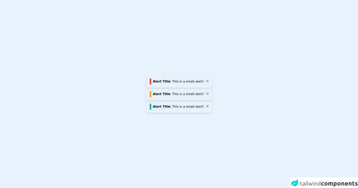
The preview of Small Modern Alerts UI component
To create a Small Modern Alerts UI component with Tailwind CSS, we will use a combination of pre-defined classes and custom CSS. The final result will look something like this:
Free download of the Small Modern Alerts's source code
The source code of Small Modern Alerts UI component
To create the Small Modern Alerts UI component, we will use the following HTML and CSS code:
<div class="flex h-screen">
  <div class="m-auto">
    <div class="shadow-md p-4 flex flex-row rounded-lg">
      <div class="bg-red-500 inline-block rounded-lg p-1 mr-1"></div>
      <b class="p-1">Alert Title</b>
      <p class="p-1">This is a small alert!</p>
      <a class="h-5 w-5 text-gray-500 inline-block p-1">
        <svg xmlns="http://www.w3.org/2000/svg" class="h-5 w-5" viewBox="0 0 20 20" fill="currentColor">
          <path fill-rule="evenodd" d="M4.293 4.293a1 1 0 011.414 0L10 8.586l4.293-4.293a1 1 0 111.414 1.414L11.414 10l4.293 4.293a1 1 0 01-1.414 1.414L10 11.414l-4.293 4.293a1 1 0 01-1.414-1.414L8.586 10 4.293 5.707a1 1 0 010-1.414z" clip-rule="evenodd" />
        </svg>
      </a>
    </div>
    <div class="shadow-md p-4 flex flex-row rounded-lg">
      <div class="bg-yellow-500 inline-block rounded-lg p-1 mr-1"></div>
      <b class="p-1">Alert Title</b>
      <p class="p-1">This is a small alert!</p>
      <a class="h-5 w-5 text-gray-500 inline-block p-1">
        <svg xmlns="http://www.w3.org/2000/svg" class="h-5 w-5" viewBox="0 0 20 20" fill="currentColor">
          <path fill-rule="evenodd" d="M4.293 4.293a1 1 0 011.414 0L10 8.586l4.293-4.293a1 1 0 111.414 1.414L11.414 10l4.293 4.293a1 1 0 01-1.414 1.414L10 11.414l-4.293 4.293a1 1 0 01-1.414-1.414L8.586 10 4.293 5.707a1 1 0 010-1.414z" clip-rule="evenodd" />
        </svg>
      </a>
    </div>
    <div class="shadow-md p-4 flex flex-row rounded-lg">
      <div class="bg-green-500 inline-block rounded-lg p-1 mr-1"></div>
      <b class="p-1">Alert Title</b>
      <p class="p-1">This is a small alert!</p>
      <a class="h-5 w-5 text-gray-500 inline-block p-1">
        <svg xmlns="http://www.w3.org/2000/svg" class="h-5 w-5" viewBox="0 0 20 20" fill="currentColor">
          <path fill-rule="evenodd" d="M4.293 4.293a1 1 0 011.414 0L10 8.586l4.293-4.293a1 1 0 111.414 1.414L11.414 10l4.293 4.293a1 1 0 01-1.414 1.414L10 11.414l-4.293 4.293a1 1 0 01-1.414-1.414L8.586 10 4.293 5.707a1 1 0 010-1.414z" clip-rule="evenodd" />
        </svg>
      </a>
    </div>
  </div>
</div>
How to create a Small Modern Alerts with Tailwind CSS?
To create a Small Modern Alerts UI component with Tailwind CSS, follow these steps:
- Create a new HTML file and add the following code:
<div class="alert">
  <div class="icon">
    <svg xmlns="http://www.w3.org/2000/svg" class="h-6 w-6" fill="none" viewBox="0 0 24 24" stroke="currentColor">
      <path stroke-linecap="round" stroke-linejoin="round" stroke-width="2" d="M12 6v6m0 0v6m0-6h6m-6 0H6"/>
    </svg>
  </div>
  <div class="message">
    This is a success message.
  </div>
</div>
- Add the following CSS code to your stylesheet:
.alert {
  display: flex;
  justify-content: space-between;
  align-items: center;
  background-color: #F0FFF4;
  border: 1px solid #50C878;
  border-radius: 4px;
  padding: 10px;
  margin-bottom: 20px;
}

.icon {
  flex-shrink: 0;
  margin-right: 10px;
}

.message {
  flex-grow: 1;
  font-size: 14px;
  color: #50C878;
}
- Customize the component by changing the colors, font sizes, and other properties as needed.
Conclusion
In this article, we learned how to create a Small Modern Alerts UI component with Tailwind CSS. We saw how Tailwind CSS can be used to quickly style HTML elements and how it can be customized to meet our needs. With Tailwind CSS, we can create beautiful and functional UI components without writing any custom CSS.