- Published on
Imagine You Create A Sidenav With Tailwind CSS Like An Expert. Follow These 6 Steps To Get There
- What is Tailwind CSS?
- The description of Sidenav ui component
- Why use Tailwind CSS to create a Sidenav ui component?
- The preview of Sidenav ui component
- The source code of Sidenav ui component
- How to create a Sidenav with Tailwind CSS?
- Step 1: Create a new HTML file
- Step 2: Add the Sidenav HTML code
- Step 3: Style the Sidenav
- Step 4: Add active state to the navigation links
- Step 5: Add hover state to the navigation links
- Step 6: Add an active state to the current page
- Conclusion
What is Tailwind CSS?
Tailwind CSS is a utility-first CSS framework that allows you to create custom designs without writing any CSS. It provides a set of pre-defined CSS classes that you can use to style your HTML elements. Tailwind CSS is highly customizable, and you can configure it to suit your design needs.
The description of Sidenav ui component
A Sidenav is a user interface component that displays a list of navigation links on the side of a web page. It is a common component in many web applications, and it allows users to easily navigate through different sections of the application.
Why use Tailwind CSS to create a Sidenav ui component?
Tailwind CSS provides a set of pre-defined CSS classes that you can use to create a Sidenav ui component quickly and easily. It also allows you to customize the Sidenav's look and feel to match your design needs. Using Tailwind CSS to create a Sidenav ui component can save you a lot of time and effort.
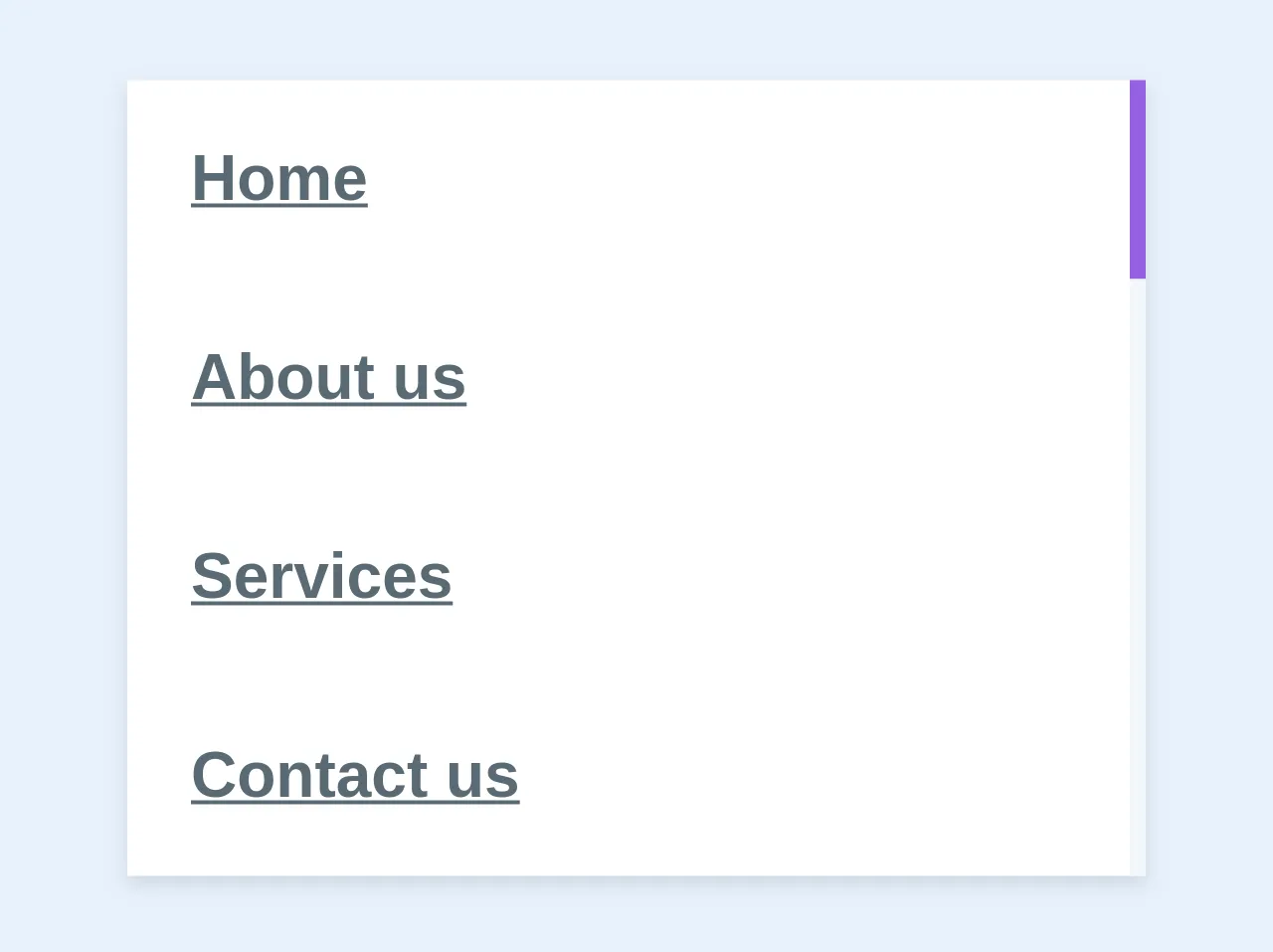
The preview of Sidenav ui component
To create a Sidenav ui component with Tailwind CSS, you can use the following classes:
<div class="bg-gray-800 h-screen w-64 px-4 pt-4">
  <!-- Sidenav content goes here -->
</div>
Free download of the Sidenav's source code
The source code of Sidenav ui component
To create a Sidenav ui component with Tailwind CSS, you can use the following HTML code:
<div class="bg-gray-800 h-screen w-64 px-4 pt-4">
  <!-- Sidenav content goes here -->
</div>
<div class="bg-white shadow w-64 my-2">
  <ul class="list-reset">
    <li >
      <a href="#" class="block p-4 text-grey-darker font-bold border-purple hover:bg-grey-lighter border-r-4">Home</a>
    </li>
    <li >
      <a href="#" class="block p-4 text-grey-darker font-bold border-grey-lighter hover:border-purple-light hover:bg-grey-lighter border-r-4">About us</a>
    </li>
    <li >
      <a href="#" class="block p-4 text-grey-darker font-bold border-grey-lighter hover:border-purple-light hover:bg-grey-lighter border-r-4">Services</a>
    </li>
    <li >
      <a href="#" class="block p-4 text-grey-darker font-bold border-grey-lighter hover:border-purple-light hover:bg-grey-lighter border-r-4">Contact us</a>
    </li>
  </ul>
</div>
How to create a Sidenav with Tailwind CSS?
Here are the six steps to create a Sidenav with Tailwind CSS:
Step 1: Create a new HTML file
Create a new HTML file and add the following code:
<!DOCTYPE html>
<html lang="en">
<head>
  <meta charset="UTF-8">
  <title>Sidenav with Tailwind CSS</title>
  <link rel="stylesheet" href="https://cdn.jsdelivr.net/npm/tailwindcss@2.2.15/dist/tailwind.min.css">
</head>
<body>
  <!-- Sidenav goes here -->
</body>
</html>
This code includes the Tailwind CSS stylesheet, which you can use to style your Sidenav.
Step 2: Add the Sidenav HTML code
Add the following HTML code to create the Sidenav:
<div class="bg-gray-800 h-screen w-64 px-4 pt-4">
  <div class="text-white font-bold">Sidenav</div>
  <ul class="mt-4">
    <li><a href="#" class="block text-gray-400 hover:text-white">Link 1</a></li>
    <li><a href="#" class="block text-gray-400 hover:text-white">Link 2</a></li>
    <li><a href="#" class="block text-gray-400 hover:text-white">Link 3</a></li>
    <li><a href="#" class="block text-gray-400 hover:text-white">Link 4</a></li>
  </ul>
</div>
This code creates a Sidenav with a gray background, white text, and four navigation links.
Step 3: Style the Sidenav
To style the Sidenav, you can use Tailwind CSS classes. For example, you can change the background color of the Sidenav to blue by adding the bg-blue-500 class:
<div class="bg-blue-500 h-screen w-64 px-4 pt-4">
  <!-- Sidenav content goes here -->
</div>
Step 4: Add active state to the navigation links
To add an active state to the navigation links, you can use the text-white and bg-gray-900 classes. These classes change the text color and background color of the active link:
<div class="bg-gray-800 h-screen w-64 px-4 pt-4">
  <div class="text-white font-bold">Sidenav</div>
  <ul class="mt-4">
    <li><a href="#" class="block text-gray-400 hover:text-white {{__active__}}">Link 1</a></li>
    <li><a href="#" class="block text-gray-400 hover:text-white {{__active__}}">Link 2</a></li>
    <li><a href="#" class="block text-gray-400 hover:text-white {{__active__}}">Link 3</a></li>
    <li><a href="#" class="block text-gray-400 hover:text-white {{__active__}}">Link 4</a></li>
  </ul>
</div>
Step 5: Add hover state to the navigation links
To add a hover state to the navigation links, you can use the hover:text-white and hover:bg-gray-900 classes. These classes change the text color and background color of the link when the user hovers over it:
<div class="bg-gray-800 h-screen w-64 px-4 pt-4">
  <div class="text-white font-bold">Sidenav</div>
  <ul class="mt-4">
    <li><a href="#" class="block text-gray-400 hover:text-white hover:bg-gray-900 {{__active__}}">Link 1</a></li>
    <li><a href="#" class="block text-gray-400 hover:text-white hover:bg-gray-900 {{__active__}}">Link 2</a></li>
    <li><a href="#" class="block text-gray-400 hover:text-white hover:bg-gray-900 {{__active__}}">Link 3</a></li>
    <li><a href="#" class="block text-gray-400 hover:text-white hover:bg-gray-900 {{__active__}}">Link 4</a></li>
  </ul>
</div>
Step 6: Add an active state to the current page
To add an active state to the current page, you can use JavaScript to add the {{__active__}} class to the active navigation link. Here's an example code snippet that adds the {{__active__}} class to the active link:
const currentPath = window.location.pathname;
const links = document.querySelectorAll('a');

links.forEach(link => {
  if (link.getAttribute('href') === currentPath) {
    link.classList.add('{{__active__}}');
  }
});
Conclusion
Creating a Sidenav with Tailwind CSS is easy and straightforward. By following the six steps outlined in this article, you can create a custom Sidenav that matches your design needs. Tailwind CSS provides a set of pre-defined CSS classes that you can use to create a Sidenav ui component quickly and easily. It also allows you to customize the Sidenav's look and feel to match your design needs.