- Published on
Beginners Guide: Create A Notification Pop With Tailwind CSS
- What is Tailwind CSS?
- The description of Notification pop UI component
- Why use Tailwind CSS to create a Notification pop UI component?
- The preview of Notification pop UI component
- The source code of Notification pop UI component
- How to create a Notification pop with Tailwind CSS?
- Step 1: Create the HTML structure
- Step 2: Style the Notification pop with Tailwind CSS
- Step 3: Add JavaScript functionality to the Notification pop
- Conclusion
As a FrontEnd technology blogger, it is essential to keep up with the latest trends and tools in the industry. One such tool that has gained popularity in recent times is Tailwind CSS. It is a utility-first CSS framework that makes designing websites faster and more accessible. In this article, we will discuss how to create a Notification pop using Tailwind CSS.
What is Tailwind CSS?
Tailwind CSS is a utility-first CSS framework that offers a set of pre-defined classes that can be used to style HTML elements. It is different from other CSS frameworks like Bootstrap or Foundation, which provide pre-designed UI components. With Tailwind CSS, you have complete control over the design of your website.
The description of Notification pop UI component
A Notification pop is a UI component that displays a message to the user. It is commonly used to provide feedback or alert the user of an event. A Notification pop can be designed in various ways, but the most common design is a small box that appears on the top or bottom of the screen.
Why use Tailwind CSS to create a Notification pop UI component?
Tailwind CSS offers several advantages when it comes to creating a Notification pop UI component. Firstly, it provides a set of pre-defined classes that can be used to style the Notification pop. This makes it easier to design the UI component without writing custom CSS code. Secondly, Tailwind CSS is lightweight, which means it does not add unnecessary bloat to your website. Lastly, Tailwind CSS is easy to learn, which makes it an ideal choice for beginners.
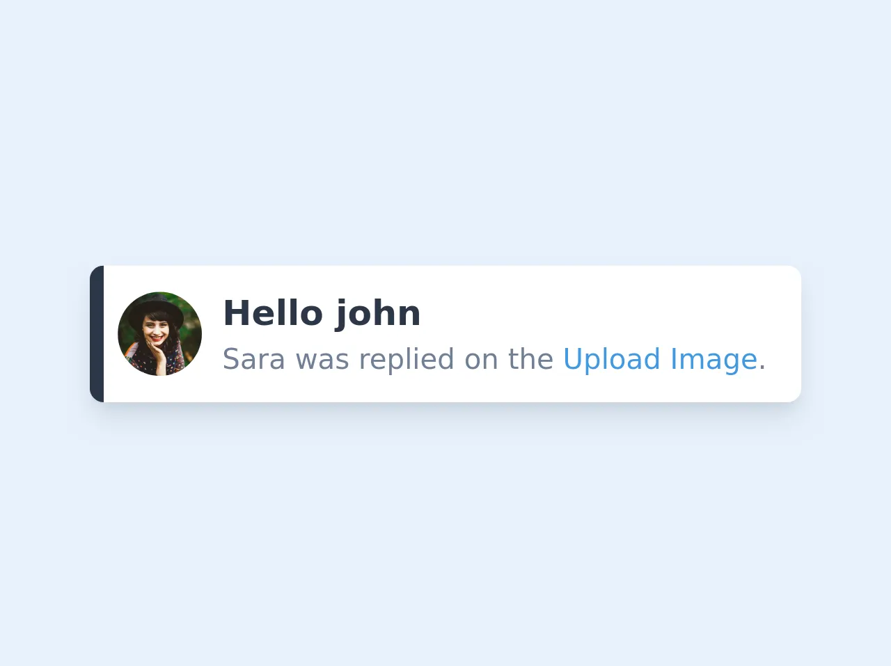
The preview of Notification pop UI component
A Notification pop UI component can be designed in various ways. Here is a preview of what we will be creating in this tutorial:
Free download of the Notification pop's source code
The source code of Notification pop UI component
To create a Notification pop UI component, we will be using HTML, CSS, and JavaScript. Here is the source code that we will be using:
<div class="flex max-w-md bg-white shadow-lg rounded-lg overflow-hidden">
  <div class="w-2 bg-gray-800"></div>
  <div class="flex items-center px-2 py-3">
    <img class="w-12 h-12 object-cover rounded-full" src="https://images.unsplash.com/photo-1477118476589-bff2c5c4cfbb?ixlib=rb-1.2.1&ixid=eyJhcHBfaWQiOjEyMDd9&auto=format&fit=crop&w=500&q=60">
    <div class="mx-3">
      <h2 class="text-xl font-semibold text-gray-800">Hello john</h2>
      <p class="text-gray-600">Sara was replied on the <a href="#" class="text-blue-500">Upload Image</a>.</p>
    </div>
  </div>
</div>
How to create a Notification pop with Tailwind CSS?
Now that we have a basic understanding of Tailwind CSS and Notification pop UI component, let's dive into the steps required to create a Notification pop with Tailwind CSS.
Step 1: Create the HTML structure
The first step is to create the HTML structure for the Notification pop. We will be using a div element with a class of "notification" to create the Notification pop. Here is the HTML code:
<div class="notification">
<span class="close-btn">×</span>
<p>This is a Notification pop</p>
</div>
In the above code, we have added a close button with an "x" symbol to the Notification pop. This button will allow the user to close the Notification pop.
Step 2: Style the Notification pop with Tailwind CSS
The next step is to style the Notification pop using Tailwind CSS. We will be using the following classes:
- bg-blue-100: This class sets the background color of the Notification pop to blue.
- border-l-4: This class adds a left border of 4 pixels to the Notification pop.
- border-blue-500: This class sets the color of the left border to blue.
- text-blue-700: This class sets the color of the text to blue.
- px-4: This class adds padding of 4 pixels to the left and right of the Notification pop.
- py-3: This class adds padding of 3 pixels to the top and bottom of the Notification pop.
- flex: This class makes the Notification pop a flex container.
- items-center: This class centers the items horizontally in the Notification pop.
- justify-between: This class justifies the items in the Notification pop with space between them.
Here is the CSS code:
.notification {
  position: fixed;
  top: 0;
  right: 0;
  width: 300px;
  background-color: #ebf8ff;
  border-left: 4px solid #63b3ed;
  padding: 1rem;
  display: flex;
  align-items: center;
  justify-content: space-between;
  z-index: 9999;
}

.notification p {
  color: #3182ce;
}

.close-btn {
  cursor: pointer;
  font-size: 1.5rem;
  font-weight: bold;
  color: #3182ce;
}
In the above code, we have added a few extra styles to position the Notification pop at the top-right corner of the screen.
Step 3: Add JavaScript functionality to the Notification pop
The final step is to add JavaScript functionality to the Notification pop. We will be using JavaScript to show and hide the Notification pop when the user clicks on the close button.
Here is the JavaScript code:
const notification = document.querySelector('.notification');
const closeBtn = document.querySelector('.close-btn');

closeBtn.addEventListener('click', () => {
  notification.style.display = 'none';
});
In the above code, we have selected the Notification pop and the close button using their respective classes. We have then added an event listener to the close button that hides the Notification pop when clicked.
Conclusion
In this article, we have discussed how to create a Notification pop using Tailwind CSS. We have covered the basic HTML structure, Tailwind CSS classes, and JavaScript functionality required to create a Notification pop. With this tutorial, you should be able to create your own Notification pop UI component using Tailwind CSS.