- Published on
Surprisingly Effective Ways To Make A Multiple Modals On The Same Page With Tailwind CSS
- What is Tailwind CSS?
- The description of Multiple Modals on the same page ui component
- Why use Tailwind CSS to create a Multiple Modals on the same page ui component?
- The preview of Multiple Modals on the same page ui component.
- The source code of Multiple Modals on the same page ui component.
- How to create a Multiple Modals on the same page with Tailwind CSS?
- Conclusion
What is Tailwind CSS?
Tailwind CSS is a utility-first CSS framework that provides a set of pre-defined CSS classes that can be used to quickly and easily style HTML elements. It is designed to be highly customizable, allowing developers to create unique designs without having to write custom CSS from scratch.
The description of Multiple Modals on the same page ui component
Multiple modals on the same page is a UI component that allows users to view multiple modals without having to navigate away from the current page. This UI component is useful when you need to display multiple pieces of information or actions that require user input.
Why use Tailwind CSS to create a Multiple Modals on the same page ui component?
Tailwind CSS makes it easy to create multiple modals on the same page UI component. With its pre-defined CSS classes, you can quickly and easily style your modals without having to write custom CSS from scratch. This saves you time and allows you to focus on the functionality of your UI component.
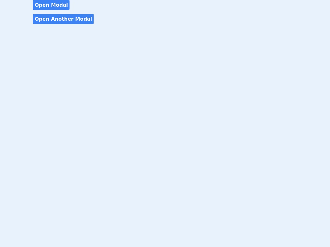
The preview of Multiple Modals on the same page ui component.
Creating multiple modals on the same page with Tailwind CSS is easy. You can use the z-50 class to set the z-index of your modals, ensuring that they appear on top of other elements on the page. You can also use the fixed class to make your modals fixed position, ensuring that they stay in place even when the user scrolls the page. Finally, you can use the hidden class to hide your modals by default, and the block class to show them when needed.
Free download of the Multiple Modals on the same page's source code
The source code of Multiple Modals on the same page ui component.
Creating multiple modals on the same page with Tailwind CSS is easy. You can use the following HTML and CSS code to create your modals:
<!-- component -->
<style>
		.animated {
			-webkit-animation-duration: 1s;
			animation-duration: 1s;
			-webkit-animation-fill-mode: both;
			animation-fill-mode: both;
		}

		.animated.faster {
			-webkit-animation-duration: 500ms;
			animation-duration: 500ms;
		}

		.fadeIn {
			-webkit-animation-name: fadeIn;
			animation-name: fadeIn;
		}

		.fadeOut {
			-webkit-animation-name: fadeOut;
			animation-name: fadeOut;
		}

		@keyframes fadeIn {
			from {
				opacity: 0;
			}

			to {
				opacity: 1;
			}
		}

		@keyframes fadeOut {
			from {
				opacity: 1;
			}

			to {
				opacity: 0;
			}
		}
	</style>

	<div>
		<button onclick="openModal('main-modal')" class='bg-blue-500 text-white p-2 rounded text-2xl font-bold'>Open Modal</button>
	</div>
    <div>
		<button onclick="openModal('another-modal')" class='mt-5 bg-blue-500 text-white p-2 rounded text-2xl font-bold'>Open Another Modal</button>
	</div>

	<div class="main-modal fixed w-full inset-0 z-50 overflow-hidden flex justify-center items-center animated fadeIn faster" style="background: rgba(0,0,0,.7);">
		<div class="border border-blue-500 shadow-lg modal-container bg-white w-4/12 md:max-w-11/12 mx-auto rounded-xl shadow-lg z-50 overflow-y-auto">
			<div class="modal-content py-4 text-left px-6">
				<!--Title-->
				<div class="flex justify-between items-center pb-3">
					<p class="text-2xl font-bold text-gray-500">Add Caretaker</p>
					<div class="modal-close cursor-pointer z-50" onclick="modalClose('main-modal')">
						<svg class="fill-current text-gray-500" xmlns="http://www.w3.org/2000/svg" width="18" height="18"
							viewBox="0 0 18 18">
							<path
								d="M14.53 4.53l-1.06-1.06L9 7.94 4.53 3.47 3.47 4.53 7.94 9l-4.47 4.47 1.06 1.06L9 10.06l4.47 4.47 1.06-1.06L10.06 9z">
							</path>
						</svg>
					</div>
				</div>
				<!--Body-->
				<div class="my-5 mr-5 ml-5 flex justify-center">
                    <form action="{{url_for('default.add_caretaker', apartment_id = apartment.id)}}" method="POST" id="add_caretaker_form"  class="w-full">
                        <div class="">
                            <div class="">
                                <label for="names" class="text-md text-gray-600">Full Names</label>
                            </div>
                            <div class="">
                                <input type="text" id="names" autocomplete="off" name="names" class="h-3 p-6 w-full border-2 border-gray-300 mb-5 rounded-md" placeholder="Example. John Doe">
                            </div>
                            <div class="">
                                <label for="phone" class="text-md text-gray-600">Phone Number</label>
                            </div>
                            <div class="">
                                <input type="text" id="phone" autocomplete="off" name="phone" class="h-3 p-6 w-full border-2 border-gray-300 mb-5 rounded-md" placeholder="Example. 0729400426">
                            </div>
                            <div class="">
                                <label for="id_number" class="text-md text-gray-600">ID Number</label>
                            </div>
                            <div class="">
                                <input type="number" id="id_number" autocomplete="off" name="id_number" class="h-3 p-6 w-full border-2 border-gray-300 mb-5 rounded-md" placeholder="Caretaker's ID number">
                            </div>
                        </div>
                    </form>
				</div>
				<!--Footer-->
				<div class="flex justify-end pt-2 space-x-14">
					<button
						class="px-4 bg-gray-200 p-3 rounded text-black hover:bg-gray-300 font-semibold" onclick="modalClose('main-modal')">Cancel</button>
					<button
						class="px-4 bg-blue-500 p-3 ml-3 rounded-lg text-white hover:bg-teal-400" onclick="validate_form(document.getElementById('add_caretaker_form'))">Confirm</button>
				</div>
			</div>
		</div>
	</div>
    <div class="another-modal fixed w-full inset-0 z-50 overflow-hidden flex justify-center items-center animated fadeIn faster" style="background: rgba(0,0,0,.7);">
		<div class="border border-blue-500 shadow-lg modal-container bg-white w-4/12 md:max-w-11/12 mx-auto rounded-xl shadow-lg z-50 overflow-y-auto">
			<div class="modal-content py-4 text-left px-6">
				<!--Title-->
				<div class="flex justify-between items-center pb-3">
					<p class="text-2xl font-bold text-gray-500">Edit Caretaker</p>
					<div class="modal-close cursor-pointer z-50" onclick="modalClose('another-modal')">
						<svg class="fill-current text-gray-500" xmlns="http://www.w3.org/2000/svg" width="18" height="18"
							viewBox="0 0 18 18">
							<path
								d="M14.53 4.53l-1.06-1.06L9 7.94 4.53 3.47 3.47 4.53 7.94 9l-4.47 4.47 1.06 1.06L9 10.06l4.47 4.47 1.06-1.06L10.06 9z">
							</path>
						</svg>
					</div>
				</div>
				<!--Body-->
				<div class="my-5 mr-5 ml-5 flex justify-center">
                    <form action="{{url_for('default.add_caretaker', apartment_id = apartment.id)}}" method="POST" id="add_caretaker_form"  class="w-full">
                        <div class="">
                            <div class="">
                                <label for="names" class="text-md text-gray-600">Full Names</label>
                            </div>
                            <div class="">
                                <input type="text" id="names" autocomplete="off" name="names" class="h-3 p-6 w-full border-2 border-gray-300 mb-5 rounded-md" placeholder="Example. John Doe">
                            </div>
                            <div class="">
                                <label for="phone" class="text-md text-gray-600">Phone Number</label>
                            </div>
                            <div class="">
                                <input type="text" id="phone" autocomplete="off" name="phone" class="h-3 p-6 w-full border-2 border-gray-300 mb-5 rounded-md" placeholder="Example. 0729400426">
                            </div>
                            <div class="">
                                <label for="id_number" class="text-md text-gray-600">ID Number</label>
                            </div>
                            <div class="">
                                <input type="number" id="id_number" autocomplete="off" name="id_number" class="h-3 p-6 w-full border-2 border-gray-300 mb-5 rounded-md" placeholder="Caretaker's ID number">
                            </div>
                        </div>
                    </form>
				</div>
				<!--Footer-->
				<div class="flex justify-end pt-2 space-x-14">
					<button
						class="px-4 bg-gray-200 p-3 rounded text-black hover:bg-gray-300 font-semibold" onclick="modalClose('another-modal')">Cancel</button>
					<button
						class="px-4 bg-blue-500 p-3 ml-3 rounded-lg text-white hover:bg-teal-400" onclick="validate_form(document.getElementById('add_caretaker_form'))">Confirm</button>
				</div>
			</div>
		</div>
	</div>

	<script>
        all_modals = ['main-modal', 'another-modal']
        all_modals.forEach((modal)=>{
            const modalSelected = document.querySelector('.'+modal);
            modalSelected.classList.remove('fadeIn');
            modalSelected.classList.add('fadeOut');
            modalSelected.style.display = 'none';
        })
        const modalClose = (modal) => {
            const modalToClose = document.querySelector('.'+modal);
            modalToClose.classList.remove('fadeIn');
            modalToClose.classList.add('fadeOut');
            setTimeout(() => {
                modalToClose.style.display = 'none';
            }, 500);
        }

        const openModal = (modal) => {
            const modalToOpen = document.querySelector('.'+modal);
            modalToOpen.classList.remove('fadeOut');
            modalToOpen.classList.add('fadeIn');
            modalToOpen.style.display = 'flex';
        }

	</script>
How to create a Multiple Modals on the same page with Tailwind CSS?
To create multiple modals on the same page with Tailwind CSS, follow these steps:
Create your HTML structure: Create a container for your modals and add a separate modal element for each modal you want to display. Give each modal a unique ID.
Style your modals: Use Tailwind CSS classes to style your modals. Use the
z-50class to set the z-index of your modals, thefixedclass to make them fixed position, and thehiddenclass to hide them by default.Add event listeners: Add event listeners to your buttons or links that will trigger the display of your modals. Use JavaScript to add or remove the
hiddenclass to show or hide your modals.Customize your modals: Customize your modals by adding your own content and styling.
Conclusion
Creating multiple modals on the same page with Tailwind CSS is a great way to provide users with a seamless experience when viewing multiple pieces of information or actions. With Tailwind CSS, you can quickly and easily style your modals without having to write custom CSS from scratch. By following the steps outlined in this article, you can create your own multiple modals on the same page UI component in no time.