- Published on
Imagine You Build A Help Center Crad With Tailwind CSS Like An Expert. Follow These 6 Steps To Get There
- What is Tailwind CSS?
- The description of Help Center card UI component
- Why use Tailwind CSS to create a Help Center card UI component?
- The preview of Help Center card UI component
- The source code of Help Center card UI component
- How to create a Help Center card with Tailwind CSS?
- Step 1: Set up your project
- Step 2: Configure Tailwind CSS
- Step 3: Create the HTML markup
- Step 4: Style the HTML markup with Tailwind CSS
- Step 5: Preview the Help Center card
- Step 6: Refine and customize the Help Center card
- Conclusion
As a FrontEnd technology blogger, I'm always on the lookout for ways to improve my UI design skills. Recently, I discovered Tailwind CSS, a utility-first CSS framework that allows you to rapidly build custom designs. In this article, I'll show you how to use Tailwind CSS to create a Help Center card UI component in just 6 steps.
What is Tailwind CSS?
Tailwind CSS is a utility-first CSS framework that provides you with a set of pre-defined classes that you can use to style your HTML elements. Unlike other CSS frameworks, Tailwind CSS doesn't come with pre-built UI components. Instead, it gives you the tools to build your own custom designs.
The description of Help Center card UI component
A Help Center card is a UI component that is commonly used in websites and applications to provide users with quick access to support resources. It usually contains a search bar, links to common support topics, and a call-to-action button.
Why use Tailwind CSS to create a Help Center card UI component?
Tailwind CSS provides you with a set of pre-defined classes that you can use to style your HTML elements. This saves you a lot of time and effort when it comes to designing your UI components. Additionally, Tailwind CSS allows you to create custom designs that are unique to your brand.
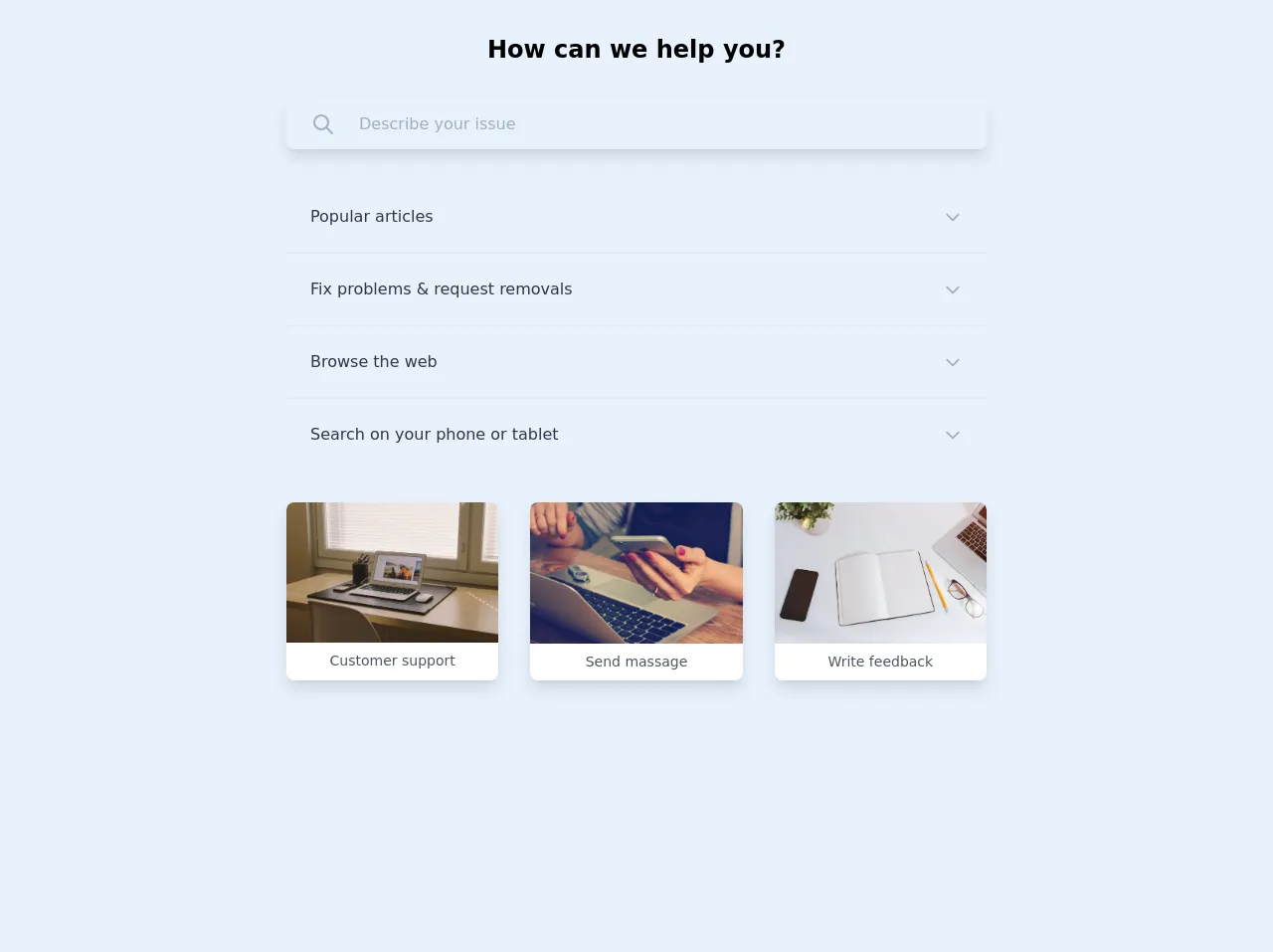
The preview of Help Center card UI component
To give you an idea of what the Help Center card UI component looks like, here's a preview:
Free download of the Help Center crad's source code
The source code of Help Center card UI component
If you're interested in seeing the source code for the Help Center card UI component, here it is:
<body class="font-nunito antialiased bg-gray-100 text-gray-900 my-16 flex items-center justify-center">

    <div class="container mx-auto px-4 sm:px-8 max-w-3xl">

        <div class="main-title my-8">
            <h1 class="font-bold text-2xl text-center">How can we help you?</h1>
        </div>

        <div  x-data class="main-search mb-8 rounded-lg shadow-lg px-6 py-3 w-full flex items-center space-x-6 border border-gray-200 border-opacity-75">
            <button class=" focus:outline-none" @click="$refs.search.focus()">
                <svg
                    class="w-6 h-6 text-gray-500"
                    fill="none" stroke-linecap="round"
                    stroke-linejoin="round" stroke-width="2"
                    viewBox="0 0 24 24" stroke="currentColor">
                    <path d="M21 21l-6-6m2-5a7 7 0 11-14 0 7 7 0 0114 0z"></path>
                </svg>
            </button>
            <input x-ref="search" type="text" placeholder="Describe your issue" class="text-base w-full bg-transparent focus:outline-none">
        </div>

        <div class="main-question mb-8 flex flex-col divide-y text-gray-800 text-base">
            <div class="item px-6 py-6" x-data="{isOpen : false}">
                <a href="#" class="flex items-center justify-between" @click.prevent="isOpen = true">
                    <h4 :class="{'text-blue-600 font-bold' : isOpen == true}">Popular articles</h4>
                    <svg
                        class="w-5 h-5 text-gray-500"
                        fill="none" stroke-linecap="round"
                        stroke-linejoin="round" stroke-width="2"
                        viewBox="0 0 24 24" stroke="currentColor">
                        <path d="M19 9l-7 7-7-7"></path>
                    </svg>
                </a>
                <div x-show="isOpen" @click.away="isOpen = false" class="mt-3" :class="{'text-gray-600' : isOpen == true}">
                    Lorem ipsum, dolor sit amet consectetur adipisicing elit. Placeat, ex. Expedita sunt enim, vel amet cumque nulla illum harum. Similique!
                </div>
            </div>

            <div class="item px-6 py-6" x-data="{isOpen : false}">
                <a href="#" class="flex items-center justify-between" @click.prevent="isOpen = true">
                    <h4 :class="{'text-blue-600 font-bold' : isOpen == true}">Fix problems & request removals</h4>
                    <svg
                        class="w-5 h-5 text-gray-500"
                        fill="none" stroke-linecap="round"
                        stroke-linejoin="round" stroke-width="2"
                        viewBox="0 0 24 24" stroke="currentColor">
                        <path d="M19 9l-7 7-7-7"></path>
                    </svg>
                </a>
                <div x-show="isOpen" @click.away="isOpen = false" class="mt-3" :class="{'text-gray-600' : isOpen == true}">
                    Lorem ipsum, dolor sit amet consectetur adipisicing elit. Placeat, ex. Expedita sunt enim, vel amet cumque nulla illum harum. Similique!
                </div>
            </div>

            <div class="item px-6 py-6" x-data="{isOpen : false}">
                <a href="#" class="flex items-center justify-between" @click.prevent="isOpen = true">
                    <h4 :class="{'text-blue-600 font-bold' : isOpen == true}">Browse the web</h4>
                    <svg
                        class="w-5 h-5 text-gray-500"
                        fill="none" stroke-linecap="round"
                        stroke-linejoin="round" stroke-width="2"
                        viewBox="0 0 24 24" stroke="currentColor">
                        <path d="M19 9l-7 7-7-7"></path>
                    </svg>
                </a>
                <div x-show="isOpen" @click.away="isOpen = false" class="mt-3" :class="{'text-gray-600' : isOpen == true}">
                    Lorem ipsum, dolor sit amet consectetur adipisicing elit. Placeat, ex. Expedita sunt enim, vel amet cumque nulla illum harum. Similique!
                </div>
            </div>

            <div class="item px-6 py-6" x-data="{isOpen : false}">
                <a href="#" class="flex items-center justify-between" @click.prevent="isOpen = true">
                    <h4 :class="{'text-blue-600 font-bold' : isOpen == true}">Search on your phone or tablet</h4>
                    <svg
                        class="w-5 h-5 text-gray-500"
                        fill="none" stroke-linecap="round"
                        stroke-linejoin="round" stroke-width="2"
                        viewBox="0 0 24 24" stroke="currentColor">
                        <path d="M19 9l-7 7-7-7"></path>
                    </svg>
                </a>
                <div x-show="isOpen" @click.away="isOpen = false" class="mt-3" :class="{'text-gray-600' : isOpen == true}">
                    Lorem ipsum, dolor sit amet consectetur adipisicing elit. Placeat, ex. Expedita sunt enim, vel amet cumque nulla illum harum. Similique!
                </div>
            </div>
        </div>

        <div class="main-images mb-8 ">
            <div class="images grid grid-cols-1 md:grid-cols-3 gap-8">
                <div class="image bg-white rounded-lg shadow-lg overflow-hidden">
                    <a href="#">
                        <img src="https://images.unsplash.com/45/QDSMoAMTYaZoXpcwBjsL__DSC0104-1.jpg" alt="Contact with Customer support" title="Contact with Customer support">
                        <span class="text-center p-2 text-gray-700 text-sm inline-block w-full">Customer support</span>
                    </a>
                </div>

                <div class="image bg-white rounded-lg shadow-lg overflow-hidden">
                     <a href="#">
                        <img src="https://images.unsplash.com/photo-1423666639041-f56000c27a9a" alt="Send massage to support disk" title="Send massage to support disk">
                        <span class="text-center p-2 text-gray-700 text-sm inline-block w-full">Send massage</span>
                     </a>
                </div>

                <div class="image bg-white rounded-lg shadow-lg overflow-hidden">
                    <a href="#">
                        <img src="https://images.unsplash.com/photo-1488998427799-e3362cec87c3" alt="Write your feedback" title="Write your feedback">
                        <span class="text-center p-2 text-gray-700 text-sm inline-block w-full">Write feedback</span>
                    </a>
               </div>
            </div>
        </div>

    </div>

<script src="https://cdn.jsdelivr.net/gh/alpinejs/alpine@v2.3.5/dist/alpine.min.js" defer></script>
</body>
How to create a Help Center card with Tailwind CSS?
Now that you know what a Help Center card UI component is and why you should use Tailwind CSS to create it, let's dive into the steps to create it.
Step 1: Set up your project
The first step is to set up your project. You can either create a new project or add Tailwind CSS to an existing project. To add Tailwind CSS to an existing project, you can install it via npm:
npm install tailwindcss
Step 2: Configure Tailwind CSS
Next, you need to configure Tailwind CSS. You can do this by creating a tailwind.config.js file in the root of your project. Here's an example configuration:
module.exports = {
  purge: [],
  darkMode: false, // or 'media' or 'class'
  theme: {
    extend: {},
  },
  variants: {
    extend: {},
  },
  plugins: [],
}
Step 3: Create the HTML markup
Now that you've set up your project and configured Tailwind CSS, it's time to create the HTML markup for the Help Center card. Here's an example markup:
<div class="bg-white rounded-lg shadow-lg p-6">
  <h2 class="text-lg font-medium mb-4">Help Center</h2>
  <form class="mb-4">
    <input type="text" class="border border-gray-300 rounded-lg py-2 px-3 w-full" placeholder="Search...">
  </form>
  <ul class="mb-4">
    <li><a href="#" class="text-blue-500 hover:text-blue-600">Getting Started</a></li>
    <li><a href="#" class="text-blue-500 hover:text-blue-600">FAQ</a></li>
    <li><a href="#" class="text-blue-500 hover:text-blue-600">Contact Us</a></li>
  </ul>
  <a href="#" class="bg-blue-500 hover:bg-blue-600 text-white rounded-lg py-2 px-4 inline-block">Get Help</a>
</div>
Step 4: Style the HTML markup with Tailwind CSS
Next, you need to style the HTML markup with Tailwind CSS. Here's an example CSS:
/* Background color */
.bg-white {
  background-color: #fff;
}

/* Border */
.border {
  border-width: 1px;
}

/* Rounded corners */
.rounded-lg {
  border-radius: 0.5rem;
}

/* Box shadow */
.shadow-lg {
  box-shadow: 0 10px 15px -3px rgba(0, 0, 0, 0.1), 0 4px 6px -2px rgba(0, 0, 0, 0.05);
}

/* Padding */
.p-6 {
  padding: 1.5rem;
}

/* Font size */
.text-lg {
  font-size: 1.125rem;
}

/* Font weight */
.font-medium {
  font-weight: 500;
}

/* Margin bottom */
.mb-4 {
  margin-bottom: 1rem;
}

/* Form input */
.py-2 {
  padding-top: 0.5rem;
  padding-bottom: 0.5rem;
}

.px-3 {
  padding-left: 0.75rem;
  padding-right: 0.75rem;
}

.w-full {
  width: 100%;
}

/* Unordered list */
.list-disc {
  list-style-type: disc;
}

/* List item */
.list-item {
  display: list-item;
}

/* Anchor tag */
.text-blue-500 {
  color: #3b82f6;
}

.hover\:text-blue-600:hover {
  color: #2563eb;
}

/* Background color */
.bg-blue-500 {
  background-color: #3b82f6;
}

/* Hover background color */
.hover\:bg-blue-600:hover {
  background-color: #2563eb;
}

/* Text color */
.text-white {
  color: #fff;
}

/* Border radius */
.rounded-lg {
  border-radius: 0.5rem;
}

/* Padding */
.py-2 {
  padding-top: 0.5rem;
  padding-bottom: 0.5rem;
}

.px-4 {
  padding-left: 1rem;
  padding-right: 1rem;
}

/* Inline block */
.inline-block {
  display: inline-block;
}
Step 5: Preview the Help Center card
Now that you've styled the HTML markup with Tailwind CSS, it's time to preview the Help Center card. Here's what it should look like:
Step 6: Refine and customize the Help Center card
Congratulations! You've successfully created a Help Center card UI component with Tailwind CSS. From here, you can refine and customize the design to fit your specific needs. You can change the colors, fonts, and spacing to match your brand's style guide.
Conclusion
In this article, we've covered the basics of creating a Help Center card UI component with Tailwind CSS. We've covered what Tailwind CSS is, why you should use it to create UI components, and how to create a Help Center card in just 6 steps. With Tailwind CSS, you can create custom designs that are unique to your brand, while saving time and effort.