- Published on
Best Ways To Build A Datepicker With Inline Editing Using AlpineJS With Tailwind CSS
- What is Tailwind CSS?
- The description of Datepicker with inline editing using AlpineJS ui component
- Why use Tailwind CSS to create a Datepicker with inline editing using AlpineJS ui component?
- The preview of Datepicker with inline editing using AlpineJS ui component
- The source code of Datepicker with inline editing using AlpineJS ui component
- How to create a Datepicker with inline editing using AlpineJS with Tailwind CSS?
- Step 1: Set up the project
- Step 2: Create the UI component
- Step 3: Add the Datepicker UI component
- Step 4: Style the UI component
- Conclusion
What is Tailwind CSS?
Tailwind CSS is a utility-first CSS framework that helps developers create custom designs without writing any CSS code. It provides a set of pre-defined CSS classes that can be used to style HTML elements. Tailwind CSS is highly customizable and can be integrated with other front-end frameworks like React, Vue, and Angular.
The description of Datepicker with inline editing using AlpineJS ui component
A Datepicker with inline editing is a UI component that allows users to select a date and edit it inline. This UI component is useful for applications that require users to select and edit dates frequently. AlpineJS is a lightweight JavaScript framework that can be used to add interactivity to HTML elements. It provides a set of declarative directives that can be used to bind data to HTML elements.
Why use Tailwind CSS to create a Datepicker with inline editing using AlpineJS ui component?
Tailwind CSS provides a set of pre-defined CSS classes that can be used to style the Datepicker with inline editing UI component. This helps developers to create custom designs without writing any CSS code. AlpineJS provides a set of declarative directives that can be used to bind data to HTML elements. This helps developers to create interactive UI components without writing any JavaScript code.
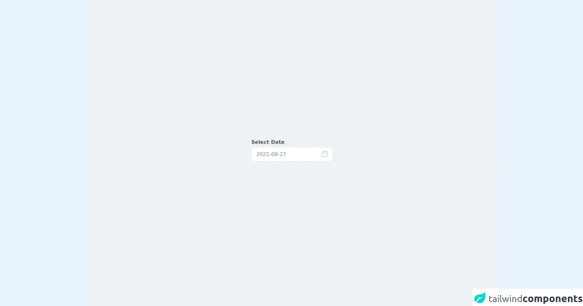
The preview of Datepicker with inline editing using AlpineJS ui component
Free download of the Datepicker with inline editing using AlpineJS's source code
The source code of Datepicker with inline editing using AlpineJS ui component
<div class="h-screen w-screen flex items-center justify-center bg-gray-200 ">
  <link rel="stylesheet" href="https://unpkg.com/tailwindcss@^1.0/dist/tailwind.min.css">
  <script src="https://cdn.jsdelivr.net/gh/alpinejs/alpine@v2.x.x/dist/alpine.js" defer></script>

    <div x-data="app()" x-init="[initDate(), getNoOfDays()]" x-cloak>
        <div class="container mx-auto">
            <div class="mb-5">
                <label for="datepicker" class="font-bold mb-1 text-gray-700 block">Select Date</label>
                <div class="relative">
                    <input type="hidden" name="date" x-ref="date" :value="datepickerValue" />
                    <input type="text" x-on:click="initDate(datepickerValue), showDatepicker = !showDatepicker" x-model="datepickerValue"
                        x-on:keydown.escape="showDatepicker = false"
                        class="w-full pl-4 pr-10 py-3 leading-none rounded-lg shadow-sm focus:outline-none focus:shadow-outline text-gray-600 font-medium"
                        placeholder="Select date" />

                    <div class="absolute top-0 right-0 px-3 py-2">
                        <svg class="w-6 h-6 text-gray-400" fill="none" viewBox="0 0 24 24" stroke="currentColor">
                            <path stroke-linecap="round" stroke-linejoin="round" stroke-width="2"
                                d="M8 7V3m8 4V3m-9 8h10M5 21h14a2 2 0 002-2V7a2 2 0 00-2-2H5a2 2 0 00-2 2v12a2 2 0 002 2z" />
                        </svg>
                    </div>

                    <div class="absolute top-0 left-0 p-4 mt-12 bg-white rounded-lg shadow" style="width: 17rem"
                        x-show.transition="showDatepicker" @click.away="showDatepicker = false">
                        <div class="flex items-center justify-between mb-2">
                            <div>
                                <span x-text="MONTH_NAMES[month]" class="text-lg font-bold text-gray-800"></span>
                                <span x-text="year" class="ml-1 text-lg font-normal text-gray-600"></span>
                            </div>
                            <div>
                                <button type="button"
                                    class="inline-flex p-1 transition duration-100 ease-in-out rounded-full cursor-pointer focus:outline-none focus:shadow-outline hover:bg-gray-100"
                                    @click="if (month == 0) {
                                                    year--;
                                                    month = 12;
                                                } month--; getNoOfDays()">
                                    <svg class="inline-flex w-6 h-6 text-gray-400" fill="none" viewBox="0 0 24 24"
                                        stroke="currentColor">
                                        <path stroke-linecap="round" stroke-linejoin="round" stroke-width="2"
                                            d="M15 19l-7-7 7-7" />
                                    </svg>
                                </button>
                                <button type="button"
                                    class="inline-flex p-1 transition duration-100 ease-in-out rounded-full cursor-pointer focus:outline-none focus:shadow-outline hover:bg-gray-100"
                                    @click="if (month == 11) {
                                                    month = 0;
                                                    year++;
                                                } else {
                                                    month++;
                                                } getNoOfDays()">
                                    <svg class="inline-flex w-6 h-6 text-gray-400" fill="none" viewBox="0 0 24 24"
                                        stroke="currentColor">
                                        <path stroke-linecap="round" stroke-linejoin="round" stroke-width="2"
                                            d="M9 5l7 7-7 7" />
                                    </svg>
                                </button>
                            </div>
                        </div>

                        <div class="flex flex-wrap mb-3 -mx-1">
                            <template x-for="(day, index) in DAYS" :key="index">
                                <div style="width: 14.26%" class="px-0.5">
                                    <div x-text="day" class="text-xs font-medium text-center text-gray-800"></div>
                                </div>
                            </template>
                        </div>

                        <div class="flex flex-wrap -mx-1">
                            <template x-for="blankday in blankdays">
                                <div style="width: 14.28%" class="p-1 text-sm text-center border border-transparent"></div>
                            </template>
                            <template x-for="(date, dateIndex) in no_of_days" :key="dateIndex">
                                <div style="width: 14.28%" class="px-1 mb-1">
                                    <div @click="getDateValue(date)" x-text="date"
                                        class="text-sm leading-none leading-loose text-center transition duration-100 ease-in-out rounded-full cursor-pointer"
                                        :class="{
                            'bg-indigo-200': isToday(date) == true,
                            'text-gray-600 hover:bg-indigo-200': isToday(date) == false && isSelectedDate(date) == false,
                            'bg-indigo-500 text-white hover:bg-opacity-75': isSelectedDate(date) == true
                        }"></div>
                                </div>
                            </template>
                        </div>
                    </div>
                </div>
            </div>
        </div>
    </div>

    <script>
        const MONTH_NAMES = [
            "January",
            "February",
            "March",
            "April",
            "May",
            "June",
            "July",
            "August",
            "September",
            "October",
            "November",
            "December",
        ];
        const MONTH_SHORT_NAMES = [
            "Jan",
            "Feb",
            "Mar",
            "Apr",
            "May",
            "Jun",
            "Jul",
            "Aug",
            "Sep",
            "Oct",
            "Nov",
            "Dec",
        ];
        const DAYS = ["Sun", "Mon", "Tue", "Wed", "Thu", "Fri", "Sat"];

        function app() {
            return {
                showDatepicker: false,
                datepickerValue: "",
                selectedDate: "",
                dateFormat: "YYYY-MM-DD",
                month: "",
                year: "",
                no_of_days: [],
                blankdays: [],
                initDate(newDate) {
                    let today;
                    if (newDate) {
                        this.selectedDate = newDate;
                        console.log(newDate)
                    }
                    if (this.selectedDate) {
                        today = new Date(this.selectedDate.replace(/-/g, "/"));
                    } else {
                        today = new Date();
                    }
                    this.month = today.getMonth();
                    this.year = today.getFullYear();
                    this.datepickerValue = this.formatDateForDisplay(
                        today
                    );
                },
                formatDateForDisplay(date) {
                    let formattedDay = DAYS[date.getDay()];
                    let formattedDate = ("0" + date.getDate()).slice(
                        -2
                    ); // appends 0 (zero) in single digit date
                    let formattedMonth = MONTH_NAMES[date.getMonth()];
                    let formattedMonthShortName =
                        MONTH_SHORT_NAMES[date.getMonth()];
                    let formattedMonthInNumber = (
                        "0" +
                        (parseInt(date.getMonth()) + 1)
                    ).slice(-2);
                    let formattedYear = date.getFullYear();
                    if (this.dateFormat === "DD-MM-YYYY") {
                        return `${formattedDate}-${formattedMonthInNumber}-${formattedYear}`; // 02-04-2021
                    }
                    if (this.dateFormat === "YYYY-MM-DD") {
                        return `${formattedYear}-${formattedMonthInNumber}-${formattedDate}`; // 2021-04-02
                    }
                    if (this.dateFormat === "D d M, Y") {
                        return `${formattedDay} ${formattedDate} ${formattedMonthShortName} ${formattedYear}`; // Tue 02 Mar 2021
                    }
                    return `${formattedDay} ${formattedDate} ${formattedMonth} ${formattedYear}`;
                },
                isSelectedDate(date) {
                    const d = new Date(this.year, this.month, date);
                    return this.datepickerValue ===
                        this.formatDateForDisplay(d) ?
                        true :
                        false;
                },
                isToday(date) {
                    const today = new Date();
                    const d = new Date(this.year, this.month, date);
                    return today.toDateString() === d.toDateString() ?
                        true :
                        false;
                },
                getDateValue(date) {
                    let selectedDate = new Date(
                        this.year,
                        this.month,
                        date
                    );
                    this.datepickerValue = this.formatDateForDisplay(
                        selectedDate
                    );
                    // this.$refs.date.value = selectedDate.getFullYear() + "-" + ('0' + formattedMonthInNumber).slice(-2) + "-" + ('0' + selectedDate.getDate()).slice(-2);
                    this.isSelectedDate(date);
                    this.showDatepicker = false;
                },
                getNoOfDays() {
                    let daysInMonth = new Date(
                        this.year,
                        this.month + 1,
                        0
                    ).getDate();
                    // find where to start calendar day of week
                    let dayOfWeek = new Date(
                        this.year,
                        this.month
                    ).getDay();
                    let blankdaysArray = [];
                    for (var i = 1; i <= dayOfWeek; i++) {
                        blankdaysArray.push(i);
                    }
                    let daysArray = [];
                    for (var i = 1; i <= daysInMonth; i++) {
                        daysArray.push(i);
                    }
                    this.blankdays = blankdaysArray;
                    this.no_of_days = daysArray;
                },
            };
        }

    </script>
</div>
How to create a Datepicker with inline editing using AlpineJS with Tailwind CSS?
In this section, we will discuss how to create a Datepicker with inline editing using AlpineJS with Tailwind CSS. We will create a simple UI component that allows users to select and edit dates inline.
Step 1: Set up the project
To set up the project, we need to create a new HTML file and include the required CSS and JavaScript files. We will use Tailwind CSS and AlpineJS CDN links to include the required files.
<!DOCTYPE html>
<html lang="en">
  <head>
    <meta charset="UTF-8" />
    <meta name="viewport" content="width=device-width, initial-scale=1.0" />
    <title>Datepicker with Inline Editing using AlpineJS with Tailwind CSS</title>
    <link
      rel="stylesheet"
      href="https://cdn.jsdelivr.net/npm/tailwindcss@2.0.2/dist/tailwind.min.css"
    />
    <script src="https://cdn.jsdelivr.net/npm/alpinejs@2.7.3/dist/alpine.js"></script>
  </head>
  <body>
    <div class="container mx-auto my-4">
      <!-- Datepicker with inline editing UI component -->
    </div>
  </body>
</html>
Step 2: Create the UI component
To create the Datepicker with inline editing UI component, we need to define a div element with the x-data directive. The x-data directive is used to define the data that will be used in the UI component.
<div
  class="bg-white rounded-lg shadow-lg p-4"
  x-data="{ date: '2021-01-01', isEditing: false }"
>
  <!-- Datepicker with inline editing UI component -->
</div>
In the above code, we have defined a div element with the x-data directive. We have defined two data properties - date and isEditing. The date property is used to store the selected date, and the isEditing property is used to toggle the editing mode.
Step 3: Add the Datepicker UI component
To add the Datepicker UI component, we need to define an input element with the x-model and x-on directives. The x-model directive is used to bind the input value to the date property, and the x-on directive is used to toggle the editing mode.
<div
  class="bg-white rounded-lg shadow-lg p-4"
  x-data="{ date: '2021-01-01', isEditing: false }"
>
  <template x-if="!isEditing">
    <div class="flex items-center">
      <span class="text-gray-600 mr-2">{{ date }}</span>
      <button
        class="text-blue-500 hover:text-blue-700"
        x-on:click="isEditing = true"
      >
        Edit
      </button>
    </div>
  </template>
  <template x-if="isEditing">
    <div class="flex items-center">
      <input
        type="date"
        class="border rounded-lg p-2 mr-2"
        x-model="date"
      />
      <button
        class="text-blue-500 hover:text-blue-700"
        x-on:click="isEditing = false"
      >
        Save
      </button>
    </div>
  </template>
</div>
In the above code, we have defined two templates - one for the non-editing mode and one for the editing mode. In the non-editing mode, we have displayed the selected date and a button to toggle the editing mode. In the editing mode, we have displayed an input element to select the date and a button to save the changes.
Step 4: Style the UI component
To style the UI component, we can use the pre-defined Tailwind CSS classes. We can add the required CSS classes to the HTML elements to style them.
<div
  class="bg-white rounded-lg shadow-lg p-4"
  x-data="{ date: '2021-01-01', isEditing: false }"
>
  <template x-if="!isEditing">
    <div class="flex items-center">
      <span class="text-gray-600 mr-2">{{ date }}</span>
      <button
        class="text-blue-500 hover:text-blue-700"
        x-on:click="isEditing = true"
      >
        Edit
      </button>
    </div>
  </template>
  <template x-if="isEditing">
    <div class="flex items-center">
      <input
        type="date"
        class="border rounded-lg p-2 mr-2"
        x-model="date"
      />
      <button
        class="bg-blue-500 text-white rounded-lg px-4 py-2 hover:bg-blue-700"
        x-on:click="isEditing = false"
      >
        Save
      </button>
    </div>
  </template>
</div>
In the above code, we have added the required Tailwind CSS classes to the HTML elements to style them. We have used the bg-white, rounded-lg, shadow-lg, p-4, text-gray-600, text-blue-500, hover:text-blue-700, border, mr-2, bg-blue-500, text-white, px-4, py-2, and hover:bg-blue-700 classes to style the UI component.
Conclusion
In this article, we have discussed how to create a Datepicker with inline editing using AlpineJS with Tailwind CSS. We have used the x-data, x-model, x-on, and x-if directives to create the UI component. We have also used the pre-defined Tailwind CSS classes to style the UI component. This UI component is useful for applications that require users to select and edit dates frequently.