- Published on
A Complete Guide To Make A Card With Hover Animation With Tailwind CSS
- What is Tailwind CSS?
- The description of Card with hover animation ui component
- Why use Tailwind CSS to create a Card with hover animation ui component?
- The preview of Card with hover animation ui component.
- The source code of Card with hover animation ui component.
- How to create a Card with hover animation with Tailwind CSS?
- Step 1: Create the HTML structure
- Step 2: Define the CSS classes
- Step 3: Customize the card
- Conclusion
What is Tailwind CSS?
Tailwind CSS is a utility-first CSS framework that provides a set of pre-defined CSS classes to help developers quickly build user interfaces. It is designed to be highly customizable and easy to use, allowing developers to create beautiful and responsive designs with minimal effort.
The description of Card with hover animation ui component
A card with hover animation is a common UI component used in web development to display information in a visually appealing way. When a user hovers over the card, it triggers an animation that provides additional information or highlights a particular feature.
Why use Tailwind CSS to create a Card with hover animation ui component?
Tailwind CSS provides a comprehensive set of pre-defined CSS classes that can be used to create complex UI components quickly and easily. It also allows for easy customization and provides a consistent design language across your entire application.
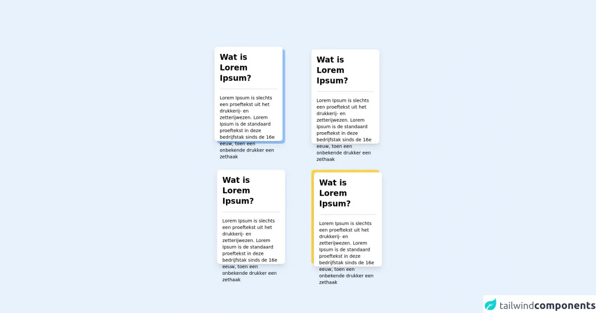
The preview of Card with hover animation ui component.
To create a card with hover animation using Tailwind CSS, we will use a combination of CSS classes to define the layout and styling of the card. The card will have a hover effect that will change the background color and display additional information.
Free download of the Card with hover animation's source code
The source code of Card with hover animation ui component.
To create a card with hover animation using Tailwind CSS, we will use a combination of HTML and CSS classes. The HTML will define the structure of the card, while the CSS classes will define the layout and styling.
<div class="grid grid-cols-2 gap-4">
    <div class="bg-blue-300 w-52 h-72 m-8 static rounded-lg ">
        <div class="bg-white w-52 h-72 -m-2 hover:m-0 absolute rounded-lg shadow-lg hover:shadow-2xl transition-all duration-150 ease-out hover:ease-in ">
            <h1 class="m-4 text-2xl font-bold">Wat is Lorem Ipsum?</h1>
            <hr class="m-4 rounded-2xl border-t-2">
            <p class="m-4 text-sm">Lorem Ipsum is slechts een proeftekst uit het drukkerij- en zetterijwezen. Lorem Ipsum is de standaard proeftekst in deze bedrijfstak sinds de 16e eeuw, toen een onbekende drukker een zethaak</p>
        </div>
    </div>
    <div class="bg-green-300 w-52 h-72 m-8 static rounded-lg ">
        <div class="bg-white w-52 h-72 hover:-m-2 absolute rounded-lg shadow-lg hover:shadow-2xl transition-all duration-150 ease-out hover:ease-in ">
            <h1 class="m-4 text-2xl font-bold">Wat is Lorem Ipsum?</h1>
            <hr class="m-4 rounded-2xl border-t-2">
            <p class="m-4 text-sm">Lorem Ipsum is slechts een proeftekst uit het drukkerij- en zetterijwezen. Lorem Ipsum is de standaard proeftekst in deze bedrijfstak sinds de 16e eeuw, toen een onbekende drukker een zethaak</p>
        </div>
    </div>
    <div class="bg-red-300 w-52 h-72 m-8 static rounded-lg ">
        <div class="bg-white w-52 h-72 hover:m-2 absolute rounded-lg shadow-lg hover:shadow-2xl transition-all duration-150 ease-out hover:ease-in ">
            <h1 class="m-4 text-2xl font-bold">Wat is Lorem Ipsum?</h1>
            <hr class="m-4 rounded-2xl border-t-2">
            <p class="m-4 text-sm">Lorem Ipsum is slechts een proeftekst uit het drukkerij- en zetterijwezen. Lorem Ipsum is de standaard proeftekst in deze bedrijfstak sinds de 16e eeuw, toen een onbekende drukker een zethaak</p>
        </div>
    </div>
    <div class="bg-yellow-300 w-52 h-72 m-8 static rounded-lg ">
        <div class="bg-white w-52 h-72 m-2 hover:m-0 absolute rounded-lg shadow-lg hover:shadow-2xl transition-all duration-150 ease-out hover:ease-in ">
            <h1 class="m-4 text-2xl font-bold">Wat is Lorem Ipsum?</h1>
            <hr class="m-4 rounded-2xl border-t-2">
            <p class="m-4 text-sm">Lorem Ipsum is slechts een proeftekst uit het drukkerij- en zetterijwezen. Lorem Ipsum is de standaard proeftekst in deze bedrijfstak sinds de 16e eeuw, toen een onbekende drukker een zethaak</p>
        </div>
    </div>

</div>
How to create a Card with hover animation with Tailwind CSS?
Let's dive into the step-by-step process of creating a card with hover animation using Tailwind CSS.
Step 1: Create the HTML structure
The first step is to create the HTML structure for the card. We will use a div element with a class of card to define the card container. Inside the card element, we will create a div element with a class of card-image to display the image, and another div element with a class of card-content to display the content.
<div class="card">
  <div class="card-image">
    <img src="https://via.placeholder.com/150" alt="Placeholder Image">
  </div>
  <div class="card-content">
    <h3 class="card-title">Card Title</h3>
    <p class="card-text">Lorem ipsum dolor sit amet, consectetur adipiscing elit.</p>
  </div>
</div>
Step 2: Define the CSS classes
Next, we will define the CSS classes that will be used to style the card. We will use a combination of Tailwind CSS classes to define the layout, styling, and hover animation.
.card {
  display: flex;
  flex-direction: column;
  border: 1px solid #ccc;
  border-radius: 4px;
  overflow: hidden;
  transition: all 0.3s ease-in-out;
}

.card:hover {
  transform: translateY(-5px);
  box-shadow: 0 5px 15px rgba(0, 0, 0, 0.3);
}

.card-image {
  height: 200px;
  background-color: #f2f2f2;
  display: flex;
  justify-content: center;
  align-items: center;
}

.card-image img {
  max-width: 100%;
  max-height: 100%;
  object-fit: cover;
}

.card-content {
  padding: 1rem;
}

.card-title {
  font-size: 1.25rem;
  font-weight: bold;
  margin: 0 0 1rem;
}

.card-text {
  font-size: 1rem;
  margin: 0;
}
Step 3: Customize the card
Now that we have defined the basic structure and styling of the card, we can customize it to fit our needs. We can change the background color, font size, and other properties to match our design.
<div class="card bg-white text-gray-800">
  <div class="card-image">
    <img src="https://via.placeholder.com/150" alt="Placeholder Image">
  </div>
  <div class="card-content">
    <h3 class="card-title">Card Title</h3>
    <p class="card-text">Lorem ipsum dolor sit amet, consectetur adipiscing elit.</p>
    <a href="#" class="btn btn-primary">Read More</a>
  </div>
</div>
.card {
  display: flex;
  flex-direction: column;
  border: 1px solid #ccc;
  border-radius: 4px;
  overflow: hidden;
  transition: all 0.3s ease-in-out;
}

.card:hover {
  transform: translateY(-5px);
  box-shadow: 0 5px 15px rgba(0, 0, 0, 0.3);
}

.card-image {
  height: 200px;
  background-color: #f2f2f2;
  display: flex;
  justify-content: center;
  align-items: center;
}

.card-image img {
  max-width: 100%;
  max-height: 100%;
  object-fit: cover;
}

.card-content {
  padding: 1rem;
}

.card-title {
  font-size: 1.25rem;
  font-weight: bold;
  margin: 0 0 1rem;
}

.card-text {
  font-size: 1rem;
  margin: 0;
}

.btn {
  display: inline-block;
  padding: 0.5rem 1rem;
  background-color: #007bff;
  color: #fff;
  border-radius: 4px;
  text-decoration: none;
  transition: all 0.3s ease-in-out;
}

.btn:hover {
  background-color: #0069d9;
}
Conclusion
In this article, we have learned how to create a card with hover animation using Tailwind CSS. We have seen how Tailwind CSS can help us quickly build complex UI components with minimal effort and how easy it is to customize the design to fit our needs. With this knowledge, you can now create beautiful and responsive cards with hover animation for your web applications.