- Published on
Learn How To Create A Card With Tailwind CSS Like an Expert
- What is Tailwind CSS?
- The description of Card ui component
- Why use Tailwind CSS to create a Card ui component?
- The preview of Card ui component
- The source code of Card ui component
- How to create a Card with Tailwind CSS?
- Conclusion
As a FrontEnd technology blogger, you might have heard of Tailwind CSS, a utility-first CSS framework that allows you to create responsive and customizable designs with ease. In this article, we will guide you through the process of creating a Card ui component with Tailwind CSS.
What is Tailwind CSS?
Tailwind CSS is a utility-first CSS framework that provides a set of pre-defined classes to style your HTML elements. Unlike other CSS frameworks, Tailwind CSS doesn't come with pre-designed components like buttons or cards. Instead, it provides a set of utility classes that you can use to create your own custom components.
The description of Card ui component
A Card ui component is a common design pattern used in web development to display information in a structured and visually appealing way. A Card typically consists of a header, a body, and a footer. The header usually contains a title and some optional actions, while the body contains the main content of the Card. The footer can contain additional information or actions related to the Card.
Why use Tailwind CSS to create a Card ui component?
Tailwind CSS provides a set of utility classes that can help you create a Card ui component quickly and easily. With Tailwind CSS, you don't have to write custom CSS code for every component you create. Instead, you can use pre-defined classes to style your components.
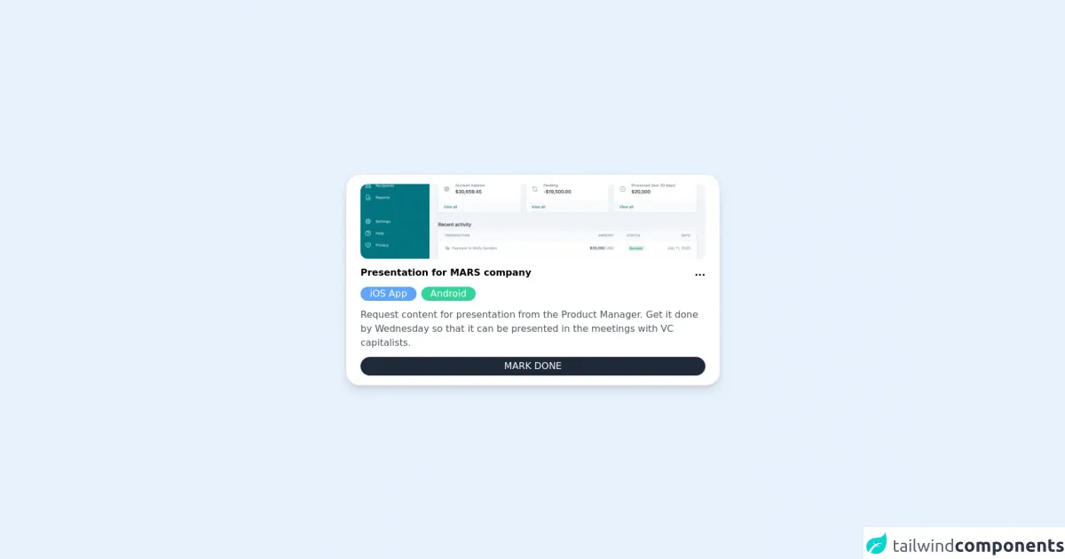
The preview of Card ui component
To create a Card ui component with Tailwind CSS, we will use the following classes:
bg-white: sets the background color of the Card to white.rounded-lg: rounds the corners of the Card.shadow-md: adds a shadow to the Card.p-6: adds padding to the Card.text-gray-700: sets the text color of the Card to gray.font-bold: makes the Card title bold.text-xl: sets the font size of the Card title to extra large.mb-2: adds margin bottom to the Card title.text-sm: sets the font size of the Card content to small.text-gray-600: sets the text color of the Card content to gray.mt-4: adds margin top to the Card footer.
Free download of the Card's source code
The source code of Card ui component
To create a Card ui component with Tailwind CSS, you can use the following HTML code:
<main class="flex items-center justify-center py-10">
  <section class="bg-white w-1/2 space-y-3 px-6 py-4 rounded-3xl shadow-lg border flex flex-col">
    <img src="https://tailwindui.com/img/components/home-screens.02-card-layout-with-sidebar-xl.png" class="w-full h-32 object-cover rounded-xl hover:filter hover:brightness-75 transition" />
    <div class="flex justify-between items-center">
      <h3 class="font-semibold">Presentation for MARS company</h3>
      <div class="font-extrabold">...</div>
    </div>
    <ul class="flex space-x-2">
      <li class="bg-blue-400 text-white text-md px-4 rounded-3xl">iOS App</li>
      <li class="bg-green-400 text-white text-md px-4 rounded-3xl">Android</li>
    </ul>
    <div class="text-gray-600 font-light">Request content for presentation from the Product Manager. Get it done by Wednesday so that it can be presented in the meetings with VC capitalists.</div>
    <button class="bg-gray-800 text-white py-1 rounded-2xl">MARK DONE</button>
  </section>
</main>
How to create a Card with Tailwind CSS?
To create a Card ui component with Tailwind CSS, follow these steps:
- Create a new HTML file and add the following code:
<div class="bg-white rounded-lg shadow-md p-6">
  <h2 class="text-gray-700 font-bold text-xl mb-2">Card Title</h2>
  <p class="text-sm text-gray-600">Card content goes here.</p>
  <div class="mt-4">Card footer goes here.</div>
</div>
Save the file and open it in your web browser. You should see a Card ui component with a white background, rounded corners, and a shadow.
To customize the Card ui component, you can add or remove classes from the HTML code. For example, to change the background color of the Card, you can replace the
bg-whiteclass with another color class, such asbg-blue-500.You can also add your own custom CSS code to the Card ui component by using the
styleattribute. For example, to change the font size of the Card title, you can add the following code:
<h2 class="text-gray-700 font-bold text-xl mb-2" style="font-size: 2rem;">Card Title</h2>
Conclusion
In this article, we have shown you how to create a Card ui component with Tailwind CSS. With Tailwind CSS, you can create responsive and customizable designs quickly and easily. By using pre-defined utility classes, you can save time and focus on creating great user experiences. We hope this article has been helpful to you, and we encourage you to continue exploring the possibilities of Tailwind CSS.