- Published on
Ultimate Guide: Create A Calendar Stripe Card With Tailwind CSS
- What is Tailwind CSS?
- The description of calendar stripe card ui component
- Why use Tailwind CSS to create a calendar stripe card ui component?
- The preview of calendar stripe card ui component
- The source code of calendar stripe card ui component
- How to create a calendar stripe card with Tailwind CSS?
- Step 1: Set up your HTML
- Step 2: Style the stripe
- Step 3: Style the month and year
- Step 4: Style the calendar
- Step 5: Add content to the calendar
- Conclusion
Are you looking for a way to create a beautiful calendar stripe card for your website or application? Look no further than Tailwind CSS. In this article, we'll walk you through the process of creating a calendar stripe card using Tailwind CSS.
What is Tailwind CSS?
Tailwind CSS is a utility-first CSS framework that allows you to quickly and easily style your website or application. With Tailwind CSS, you can create complex layouts and designs without having to write custom CSS. Tailwind CSS provides a wide range of pre-built classes that you can use to style your HTML elements.
The description of calendar stripe card ui component
A calendar stripe card is a UI component that displays a calendar with a stripe across the top. The stripe typically contains information such as the month and year. The calendar itself displays the days of the month and may include events or appointments.
Why use Tailwind CSS to create a calendar stripe card ui component?
Tailwind CSS is an excellent choice for creating a calendar stripe card UI component for several reasons:
- Tailwind CSS provides a wide range of pre-built classes that you can use to style your HTML elements.
- Tailwind CSS makes it easy to create complex layouts and designs without having to write custom CSS.
- Tailwind CSS is highly customizable, allowing you to create a unique look and feel for your calendar stripe card.
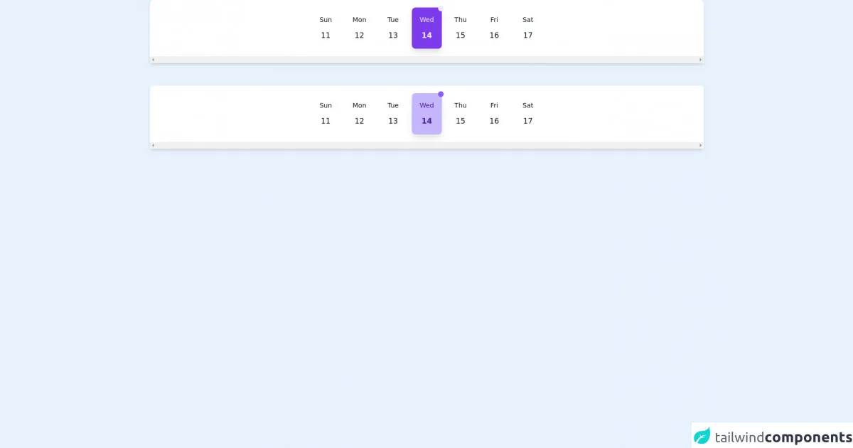
The preview of calendar stripe card ui component
To give you an idea of what a calendar stripe card UI component looks like, here's a preview:
Free download of the calendar stripe card's source code
The source code of calendar stripe card ui component
Here's the source code for a basic calendar stripe card UI component:
<!-- https://dribbble.com/shots/14959823-Dashboard-UI-Elements -->
<div className="h-screen bg-gray-100 p-6">
      <!-- { /*variation dark set*/ } -->
      <div  class='flex bg-white shadow-md justify-start md:justify-center rounded-lg overflow-x-scroll mx-auto py-4 px-2  md:mx-12'>

          <div class='flex group hover:bg-purple-500 hover:shadow-lg hover-dark-shadow rounded-lg mx-1 transition-all	duration-300	 cursor-pointer justify-center w-16'>
              <div class='flex items-center px-4 py-4'>
                  <div class='text-center'>
                     <p class='text-gray-900 group-hover:text-gray-100 text-sm transition-all	duration-300'> Sun </p>
                     <p class='text-gray-900 group-hover:text-gray-100 mt-3 group-hover:font-bold transition-all	duration-300'> 11 </p>
                  </div>
              </div>
          </div>

        <div class='flex group hover:bg-purple-500 hover:shadow-lg hover-dark-shadow rounded-lg mx-1 transition-all	duration-300	 cursor-pointer justify-center  w-16'>
              <div class='flex items-center px-4 py-4'>
                  <div class='text-center'>
                     <p class='text-gray-900 group-hover:text-gray-100 text-sm transition-all	duration-300'> Mon </p>
                     <p class='text-gray-900 group-hover:text-gray-100 mt-3 group-hover:font-bold transition-all	duration-300'> 12 </p>
                  </div>
              </div>
          </div>

        <div class='flex group hover:bg-purple-500 hover:shadow-lg hover-dark-shadow rounded-lg mx-1 transition-all	duration-300	 cursor-pointer justify-center  w-16'>
              <div class='flex items-center px-4 py-4'>
                  <div class='text-center'>
                     <p class='text-gray-900 group-hover:text-gray-100 text-sm transition-all	duration-300'> Tue </p>
                     <p class='text-gray-900 group-hover:text-gray-100 mt-3 group-hover:font-bold transition-all	duration-300'> 13</p>
                  </div>
              </div>
          </div>

          <div class='flex group bg-purple-600 shadow-lg dark-shadow rounded-lg mx-1 cursor-pointer justify-center relative  w-16'>
            <span class="flex h-3 w-3 absolute -top-1 -right-1">
              <span class="animate-ping absolute group-hover:opacity-75 opacity-0 inline-flex h-full w-full rounded-full bg-purple-400 "></span>
              <span class="relative inline-flex rounded-full h-3 w-3 bg-purple-100"></span>
            </span>
              <div class='flex items-center px-4 py-4'>
                  <div class='text-center'>
                     <p class='text-gray-100 text-sm'> Wed </p>
                     <p class='text-gray-100  mt-3 font-bold'> 14 </p>
                  </div>
              </div>
          </div>

        <div class='flex group hover:bg-purple-500 hover:shadow-lg hover-dark-shadow rounded-lg mx-1 transition-all	duration-300 cursor-pointer justify-center w-16'>
              <div class='flex items-center px-4 py-4'>
                  <div class='text-center'>
                     <p class='text-gray-900 group-hover:text-gray-100 text-sm transition-all	duration-300'> Thu </p>
                     <p class='text-gray-900 group-hover:text-gray-100 mt-3 group-hover:font-bold transition-all	duration-300'> 15 </p>
                  </div>
              </div>
          </div>

        <div class='flex group hover:bg-purple-500 hover:shadow-lg hover-dark-shadow rounded-lg mx-1 transition-all	duration-300	 cursor-pointer justify-center  w-16'>
              <div class='flex items-center px-4 py-4'>
                  <div class='text-center'>
                     <p class='text-gray-900 group-hover:text-gray-100 text-sm transition-all	duration-300'> Fri </p>
                     <p class='text-gray-900 group-hover:text-gray-100 mt-3 group-hover:font-bold transition-all	duration-300'> 16 </p>
                  </div>
              </div>
          </div>

        <div class='flex group hover:bg-purple-500 hover:shadow-lg hover-dark-shadow rounded-lg mx-1 transition-all	duration-300	 cursor-pointer justify-center w-16'>
              <div class='flex items-center px-4 py-4'>
                  <div class='text-center'>
                     <p class='text-gray-900 group-hover:text-gray-100 text-sm transition-all	duration-300'> Sat </p>
                     <p class='text-gray-900 group-hover:text-gray-100 mt-3 group-hover:font-bold transition-all	duration-300'> 17 </p>
                  </div>
              </div>
          </div>


      </div>

      <br/><br/>

      <!-- { /*variation light set*/ } -->
       <div  class='flex bg-white shadow-md justify-start md:justify-center rounded-lg overflow-x-scroll mx-auto py-4 px-2  md:mx-12'>

          <div class='flex group hover:bg-purple-100 hover:shadow-lg hover-light-shadow rounded-lg mx-1 transition-all	duration-300	 cursor-pointer justify-center w-16'>
              <div class='flex items-center px-4 py-4'>
                  <div class='text-center'>
                     <p class='text-gray-900 group-hover:text-purple-900 text-sm transition-all	duration-300'> Sun </p>
                     <p class='text-gray-900 group-hover:text-purple-900 mt-3 group-hover:font-bold transition-all	duration-300'> 11 </p>
                  </div>
              </div>
          </div>

        <div class='flex group hover:bg-purple-100 hover:shadow-lg hover-light-shadow rounded-lg mx-1 transition-all	duration-300	 cursor-pointer justify-center w-16'>
              <div class='flex items-center px-4 py-4'>
                  <div class='text-center'>
                     <p class='text-gray-900 group-hover:text-purple-900 text-sm transition-all	duration-300'> Mon </p>
                     <p class='text-gray-900 group-hover:text-purple-900 mt-3 group-hover:font-bold transition-all	duration-300'> 12 </p>
                  </div>
              </div>
          </div>

        <div class='flex group hover:bg-purple-100 hover:shadow-lg hover-light-shadow rounded-lg mx-1 transition-all	duration-300	 cursor-pointer justify-center w-16'>
              <div class='flex items-center px-4 py-4'>
                  <div class='text-center'>
                     <p class='text-gray-900 group-hover:text-purple-900 text-sm transition-all	duration-300'> Tue </p>
                     <p class='text-gray-900 group-hover:text-purple-900 mt-3 group-hover:font-bold transition-all	duration-300'> 13</p>
                  </div>
              </div>
          </div>

          <div class='flex group bg-purple-300 shadow-lg light-shadow rounded-lg mx-1 cursor-pointer justify-center relative w-16 content-center'>
            <span class="flex h-3 w-3 absolute -top-1 -right-1">
              <span class="animate-ping absolute group-hover:opacity-75 opacity-0 inline-flex h-full w-full rounded-full bg-purple-400 "></span>
              <span class="relative inline-flex rounded-full h-3 w-3 bg-purple-500"></span>
            </span>
              <div class='flex items-center px-4 py-4'>
                  <div class='text-center'>
                     <p class='text-purple-900 text-sm'> Wed </p>
                     <p class='text-purple-900  mt-3 font-bold'> 14 </p>
                  </div>
              </div>
          </div>

        <div class='flex group hover:bg-purple-100 hover:shadow-lg hover-light-shadow rounded-lg mx-1 transition-all	duration-300 content-center	 cursor-pointer justify-center w-16'>
              <div class='flex items-center px-4 py-4'>
                  <div class='text-center'>
                     <p class='text-gray-900 group-hover:text-purple-900 text-sm transition-all	duration-300'> Thu </p>
                     <p class='text-gray-900 group-hover:text-purple-900 mt-3 group-hover:font-bold transition-all	duration-300'> 15 </p>
                  </div>
              </div>
          </div>

        <div class='flex group hover:bg-purple-100 hover:shadow-lg hover-light-shadow rounded-lg mx-1 transition-all	duration-300	 cursor-pointer justify-center w-16'>
              <div class='flex items-center px-4 py-4'>
                  <div class='text-center'>
                     <p class='text-gray-900 group-hover:text-purple-900 text-sm transition-all	duration-300'> Fri </p>
                     <p class='text-gray-900 group-hover:text-purple-900 mt-3 group-hover:font-bold transition-all	duration-300'> 16 </p>
                  </div>
              </div>
          </div>

        <div class='flex group hover:bg-purple-100 hover:shadow-lg hover-light-shadow rounded-lg mx-1 transition-all	duration-300	 cursor-pointer justify-center w-16'>
              <div class='flex items-center px-4 py-4'>
                  <div class='text-center'>
                     <p class='text-gray-900 group-hover:text-purple-900 text-sm transition-all	duration-300'> Sat </p>
                     <p class='text-gray-900 group-hover:text-purple-900 mt-3 group-hover:font-bold transition-all	duration-300'> 17 </p>
                  </div>
              </div>
          </div>


      </div>


    </div>
How to create a calendar stripe card with Tailwind CSS?
Now that you know what a calendar stripe card is and why Tailwind CSS is an excellent choice for creating one, let's walk through the process of creating a calendar stripe card using Tailwind CSS.
Step 1: Set up your HTML
The first step in creating a calendar stripe card with Tailwind CSS is to set up your HTML. Here's an example:
<div class="calendar-stripe-card">
  <div class="calendar-stripe-card__stripe">
    <div class="calendar-stripe-card__month-year">January 2022</div>
  </div>
  <div class="calendar-stripe-card__calendar">
    <!-- Calendar goes here -->
  </div>
</div>
In this example, we've created a div with a class of calendar-stripe-card. Inside that div, we've created two child divs: one for the stripe and one for the calendar.
Step 2: Style the stripe
Next, we'll style the stripe. Here's the CSS:
.calendar-stripe-card__stripe {
  background-color: #0070f3;
  color: #fff;
  padding: 1rem;
}
In this example, we've set the background color of the stripe to #0070f3 and the text color to #fff. We've also added some padding to give the stripe some breathing room.
Step 3: Style the month and year
Next, we'll style the month and year text. Here's the CSS:
.calendar-stripe-card__month-year {
  font-size: 1.5rem;
  font-weight: 600;
  text-transform: uppercase;
}
In this example, we've increased the font size to 1.5rem, set the font weight to 600 (bold), and applied text-transform: uppercase to make the text all caps.
Step 4: Style the calendar
Finally, we'll style the calendar itself. Here's the CSS:
.calendar-stripe-card__calendar {
  display: grid;
  grid-template-columns: repeat(7, 1fr);
  gap: 0.5rem;
}
In this example, we've set the display to grid and created a grid with seven columns using grid-template-columns: repeat(7, 1fr). We've also added some gap between the grid items using gap: 0.5rem.
Step 5: Add content to the calendar
Now that we've set up our HTML and CSS, it's time to add content to the calendar. You can do this using standard HTML tags such as div, span, and a. Here's an example:
<div class="calendar-stripe-card__calendar">
  <span>1</span>
  <span>2</span>
  <span>3</span>
  <span>4</span>
  <span>5</span>
  <span>6</span>
  <span>7</span>
  <span>8</span>
  <span>9</span>
  <span>10</span>
  <span>11</span>
  <span>12</span>
  <span>13</span>
  <span>14</span>
  <span>15</span>
  <span>16</span>
  <span>17</span>
  <span>18</span>
  <span>19</span>
  <span>20</span>
  <span>21</span>
  <span>22</span>
  <span>23</span>
  <span>24</span>
  <span>25</span>
  <span>26</span>
  <span>27</span>
  <span>28</span>
  <span>29</span>
  <span>30</span>
  <span>31</span>
</div>
In this example, we've added span tags for each day of the month.
Conclusion
Creating a calendar stripe card UI component is easy with Tailwind CSS. By following the steps outlined in this article, you can create a beautiful and functional calendar stripe card for your website or application. With Tailwind CSS, the possibilities are endless. Happy coding!