- Published on
The Ultimate Guide To Help You Build A Blog Cards With Tailwind CSS
- What is Tailwind CSS?
- The description of Blog cards ui component
- Why use Tailwind CSS to create a Blog cards ui component?
- The preview of Blog cards ui component
- The source code of Blog cards ui component
- How to create a Blog cards with Tailwind CSS?
- Step 1: Set up your HTML structure
- Step 2: Style your HTML elements with Tailwind CSS
- Step 3: Repeat the HTML structure for each blog post
- Conclusion
If you are a blogger or a content creator, you know the importance of having an attractive and user-friendly website. One of the essential components of a website is the blog cards. Blog cards are a great way to showcase your latest blog posts in a visually appealing way. In this article, we will guide you on how to build a blog cards ui component with Tailwind CSS.
What is Tailwind CSS?
Tailwind CSS is a utility-first CSS framework that helps you create custom designs without writing any CSS code. It provides a set of pre-defined classes that you can use to style your HTML elements. Tailwind CSS is easy to learn and use, and it can help you save a lot of time when building your website.
The description of Blog cards ui component
Blog cards are a ui component that displays the title, image, and a short description of your latest blog posts. They are usually displayed on the homepage of your website or on a dedicated blog page. Blog cards are a great way to attract users' attention and encourage them to read your blog posts.
Why use Tailwind CSS to create a Blog cards ui component?
Tailwind CSS provides a set of pre-defined classes that you can use to style your HTML elements. This makes it easy to create custom designs without writing any CSS code. Tailwind CSS is also highly customizable, which means you can easily modify the styles to match your website's design. Using Tailwind CSS can help you save a lot of time when building your website.
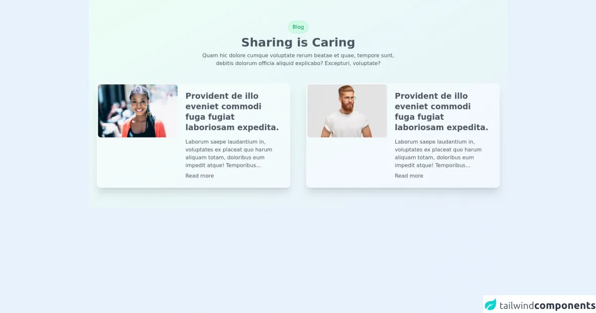
The preview of Blog cards ui component
To create a blog cards ui component with Tailwind CSS, you can use a combination of HTML and CSS code. The following is a preview of what the blog cards ui component will look like:
Free download of the Blog cards's source code
The source code of Blog cards ui component
The following is the source code for the blog cards ui component:
<div class="py-16 bg-gradient-to-br from-green-50 to-cyan-100">
  <div class="container m-auto px-6 text-gray-600 md:px-12 xl:px-6">
      <div class="mb-12 space-y-2 text-center">
        <span class="block w-max mx-auto px-3 py-1.5 border border-green-200 rounded-full bg-green-100 text-green-600">Blog</span>
        <h2 class="text-2xl text-cyan-900 font-bold md:text-4xl">Sharing is Caring</h2>
        <p class="lg:w-6/12 lg:mx-auto">Quam hic dolore cumque voluptate rerum beatae et quae, tempore sunt, debitis dolorum officia aliquid explicabo? Excepturi, voluptate?</p>
      </div>

      <div class="grid gap-12 lg:grid-cols-2">
        <div class="p-1 rounded-xl group sm:flex space-x-6 bg-white bg-opacity-50 shadow-xl hover:rounded-2xl">
          <img src="https://tailus.io/sources/blocks/twocards/preview/images/woman.jpg" alt="art cover" loading="lazy" width="1000" height="667" class="h-56 sm:h-full w-full sm:w-5/12 object-cover object-top rounded-lg transition duration-500 group-hover:rounded-xl">
          <div class="sm:w-7/12 pl-0 p-5">
            <div class="space-y-2">
              <div class="space-y-4">
                <h4 class="text-2xl font-semibold text-cyan-900">Provident de illo eveniet commodi fuga fugiat laboriosam expedita.</h4>
                <p class="text-gray-600">Laborum saepe laudantium in, voluptates ex placeat quo harum aliquam totam, doloribus eum impedit atque! Temporibus...</p>
              </div>
              <a href="www.tailus.io" class="block w-max text-cyan-600">Read more</a>
            </div>
          </div>
        </div>
        <div class="p-1 rounded-xl group sm:flex space-x-6 bg-white bg-opacity-50 shadow-xl hover:rounded-2xl">
          <img src="https://tailus.io/sources/blocks/twocards/preview/images/man.jpg" alt="art cover" loading="lazy" width="1000" height="667" class="h-56 sm:h-full w-full sm:w-5/12 object-cover object-top rounded-lg transition duration-500 group-hover:rounded-xl">
          <div class="sm:w-7/12 pl-0 p-5">
            <div class="space-y-2">
              <div class="space-y-4">
                <h4 class="text-2xl font-semibold text-cyan-900">Provident de illo eveniet commodi fuga fugiat laboriosam expedita.</h4>
                <p class="text-gray-600">Laborum saepe laudantium in, voluptates ex placeat quo harum aliquam totam, doloribus eum impedit atque! Temporibus...</p>
              </div>
              <a href="www.tailus.io" class="block w-max text-cyan-600">Read more</a>
            </div>
          </div>
        </div>
      </div>
  </div>
</div>
How to create a Blog cards with Tailwind CSS?
To create a blog cards ui component with Tailwind CSS, follow these steps:
Step 1: Set up your HTML structure
The first step is to set up your HTML structure. You can use a combination of HTML and CSS to create the blog cards ui component. Here is an example HTML structure:
<div class="blog-card">
  <div class="blog-card-image">
    <img src="blog-post-image.jpg" alt="Blog post image">
  </div>
  <div class="blog-card-content">
    <h2 class="blog-card-title">Blog post title</h2>
    <p class="blog-card-description">Blog post description</p>
    <a href="#" class="blog-card-read-more">Read more</a>
  </div>
</div>
Step 2: Style your HTML elements with Tailwind CSS
The next step is to style your HTML elements with Tailwind CSS. You can use a combination of pre-defined classes and custom classes to style your HTML elements. Here is an example of how you can style the HTML elements:
<div class="blog-card bg-white rounded-lg shadow-md overflow-hidden">
  <div class="blog-card-image">
    <img src="blog-post-image.jpg" alt="Blog post image" class="w-full h-48 object-cover">
  </div>
  <div class="blog-card-content p-4">
    <h2 class="blog-card-title text-xl font-bold mb-2">Blog post title</h2>
    <p class="blog-card-description text-gray-600 text-base">Blog post description</p>
    <a href="#" class="blog-card-read-more text-blue-500 inline-block mt-2">Read more</a>
  </div>
</div>
In the above code, we have used pre-defined classes such as bg-white, rounded-lg, shadow-md, w-full, h-48, object-cover, p-4, text-xl, font-bold, mb-2, text-gray-600, text-base, text-blue-500, and mt-2 to style our HTML elements.
Step 3: Repeat the HTML structure for each blog post
The final step is to repeat the HTML structure for each blog post. You can use a loop or a CMS to dynamically generate the HTML structure for each blog post. Here is an example of how you can repeat the HTML structure for each blog post:
<div class="blog-cards">
  <div class="blog-card bg-white rounded-lg shadow-md overflow-hidden">
    <div class="blog-card-image">
      <img src="blog-post-image-1.jpg" alt="Blog post image" class="w-full h-48 object-cover">
    </div>
    <div class="blog-card-content p-4">
      <h2 class="blog-card-title text-xl font-bold mb-2">Blog post title</h2>
      <p class="blog-card-description text-gray-600 text-base">Blog post description</p>
      <a href="#" class="blog-card-read-more text-blue-500 inline-block mt-2">Read more</a>
    </div>
  </div>

  <div class="blog-card bg-white rounded-lg shadow-md overflow-hidden">
    <div class="blog-card-image">
      <img src="blog-post-image-2.jpg" alt="Blog post image" class="w-full h-48 object-cover">
    </div>
    <div class="blog-card-content p-4">
      <h2 class="blog-card-title text-xl font-bold mb-2">Blog post title</h2>
      <p class="blog-card-description text-gray-600 text-base">Blog post description</p>
      <a href="#" class="blog-card-read-more text-blue-500 inline-block mt-2">Read more</a>
    </div>
  </div>

  <div class="blog-card bg-white rounded-lg shadow-md overflow-hidden">
    <div class="blog-card-image">
      <img src="blog-post-image-3.jpg" alt="Blog post image" class="w-full h-48 object-cover">
    </div>
    <div class="blog-card-content p-4">
      <h2 class="blog-card-title text-xl font-bold mb-2">Blog post title</h2>
      <p class="blog-card-description text-gray-600 text-base">Blog post description</p>
      <a href="#" class="blog-card-read-more text-blue-500 inline-block mt-2">Read more</a>
    </div>
  </div>
</div>
In the above code, we have repeated the HTML structure for three blog posts.
Conclusion
In conclusion, building a blog cards ui component with Tailwind CSS is easy and straightforward. Tailwind CSS provides a set of pre-defined classes that you can use to style your HTML elements. By following the steps outlined in this article, you can create a visually appealing and user-friendly blog cards ui component for your website.