- Published on
Practical Guide: Create A Basic Login With Tailwind CSS
- What is Tailwind CSS?
- The description of Basic Login UI component
- Why use Tailwind CSS to create a Basic Login UI component?
- The preview of Basic Login UI component
- The source code of Basic Login UI component
- How to create a Basic Login with Tailwind CSS?
- Step 1: Create the HTML structure
- Step 2: Add Tailwind CSS to your project
- Step 3: Customize the styles
- Conclusion
In this article, we will be discussing how to create a basic login UI component using Tailwind CSS. We will go through the process step by step, and by the end of this article, you will have a good understanding of how to use Tailwind CSS to create a login UI component.
What is Tailwind CSS?
Tailwind CSS is a utility-first CSS framework that allows you to quickly build custom user interfaces. It provides a set of pre-defined CSS classes that you can use to style your HTML elements. Tailwind CSS is highly customizable and allows you to create your own utility classes to fit your specific needs.
The description of Basic Login UI component
A basic login UI component is a common feature in many web applications. It typically consists of a form with two input fields for the user's email and password, and a submit button. The UI component should be visually appealing and easy to use.
Why use Tailwind CSS to create a Basic Login UI component?
Tailwind CSS can help you create a basic login UI component quickly and easily. It provides a set of pre-defined CSS classes that you can use to style your HTML elements. This means that you don't have to write custom CSS code from scratch, which can save you a lot of time and effort.
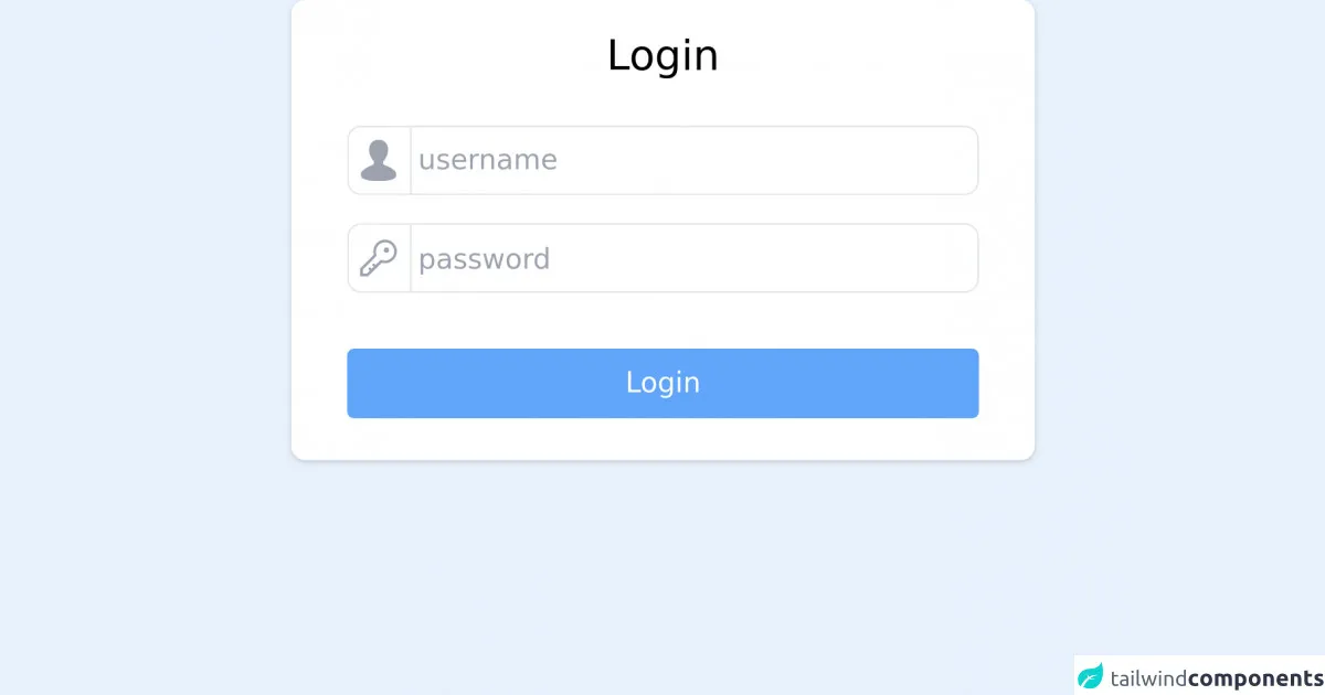
The preview of Basic Login UI component
To give you an idea of what the basic login UI component will look like, here is a preview:
Free download of the Basic Login's source code
The source code of Basic Login UI component
Here is the source code for the basic login UI component:
<!-- This is an example component -->
<form id="whoobe-t7qyk" class="justify-center items-center w-full shadow rounded-lg bg-white px-6 flex flex-col md:w-1/2 lg:w-1/3 m-auto">
    <h2 class="text-2xl my-4">Login</h2>
			<div id="whoobe-h90kl" class="w-full p-2 justify-start flex flex-col">
				<div id="whoobe-7izhv" class=" flex flex-row">
					<span id="whoobe-plfl9" class="z-highest rounded-l-lg w-10 h-10 flex justify-center items-center text-2xl text-gray-400 border border-r-0" mode="render" block="">
						<svg xmlns="http://www.w3.org/2000/svg" xmlns:xlink="http://www.w3.org/1999/xlink" aria-hidden="true" role="img" width="1em" height="1em" preserveAspectRatio="xMidYMid meet" viewBox="0 0 26 26" class="iconify iconify--wpf">
							<path d="M16.563 15.9c-.159-.052-1.164-.505-.536-2.414h-.009c1.637-1.686 2.888-4.399 2.888-7.07c0-4.107-2.731-6.26-5.905-6.26c-3.176 0-5.892 2.152-5.892 6.26c0 2.682 1.244 5.406 2.891 7.088c.642 1.684-.506 2.309-.746 2.397c-3.324 1.202-7.224 3.393-7.224 5.556v.811c0 2.947 5.714 3.617 11.002 3.617c5.296 0 10.938-.67 10.938-3.617v-.811c0-2.228-3.919-4.402-7.407-5.557z" fill="currentColor">
							</path>
						</svg>
					</span>
					<input value="" class="border border-gray-200 rounded-r-lg outline-none focus:ring-1 ring-blue-400 w-full pl-1" id="" name="" required="false" placeholder="username">
				</div>

				<div id="whoobe-l6k6r" class="my-4 flex flex-row">
					<span id="whoobe-4occ6" class="z-highest rounded-l-lg w-10 h-10 flex justify-center items-center text-2xl text-gray-400 border border-r-0" mode="render" block="">
						<svg xmlns="http://www.w3.org/2000/svg" xmlns:xlink="http://www.w3.org/1999/xlink" aria-hidden="true" role="img" width="1em" height="1em" preserveAspectRatio="xMidYMid meet" viewBox="0 0 32 32" class="iconify iconify--carbon">
							<path d="M21 2a8.998 8.998 0 0 0-8.612 11.612L2 24v6h6l10.388-10.388A9 9 0 1 0 21 2zm0 16a7.013 7.013 0 0 1-2.032-.302l-1.147-.348l-.847.847l-3.181 3.181L12.414 20L11 21.414l1.379 1.379l-1.586 1.586L9.414 23L8 24.414l1.379 1.379L7.172 28H4v-3.172l9.802-9.802l.848-.847l-.348-1.147A7 7 0 1 1 21 18z" fill="currentColor">
							</path>
							<circle cx="22" cy="10" r="2" fill="currentColor">
							</circle>
						</svg>
					</span>
					<input type="password" value="" class="h-10 border border-gray-200 rounded-r-lg outline-none focus:ring-1 ring-blue-300 w-full pl-1" id="" name="" placeholder="password" required="false">
				</div>
				<button value="button" class="px-4 py-2 rounded bg-blue-400 text-white hover:bg-blue-700 my-4 w-full" id="whoobe-ibemp">Login</button>
			</div>
		</form>
How to create a Basic Login with Tailwind CSS?
Now that you have an idea of what the basic login UI component will look like and what the source code looks like, let's dive into how to create it using Tailwind CSS.
Step 1: Create the HTML structure
The first step is to create the HTML structure for the login form. Here is an example:
<div class="flex items-center justify-center h-screen">
  <form class="bg-white p-6 rounded shadow-md">
    <div class="mb-4">
      <label class="block text-gray-700 font-bold mb-2" for="email">
        Email
      </label>
      <input
        class="shadow appearance-none border rounded w-full py-2 px-3 text-gray-700 leading-tight focus:outline-none focus:shadow-outline"
        id="email"
        type="email"
        placeholder="Email"
      />
    </div>
    <div class="mb-6">
      <label class="block text-gray-700 font-bold mb-2" for="password">
        Password
      </label>
      <input
        class="shadow appearance-none border rounded w-full py-2 px-3 text-gray-700 leading-tight focus:outline-none focus:shadow-outline"
        id="password"
        type="password"
        placeholder="Password"
      />
    </div>
    <div class="flex items-center justify-between">
      <button
        class="bg-blue-500 hover:bg-blue-700 text-white font-bold py-2 px-4 rounded focus:outline-none focus:shadow-outline"
        type="button"
      >
        Sign In
      </button>
      <a
        class="inline-block align-baseline font-bold text-sm text-blue-500 hover:text-blue-800"
        href="#"
      >
        Forgot Password?
      </a>
    </div>
  </form>
</div>
In this example, we have a div container with the flex, items-center, and justify-center classes. This will center the login form vertically and horizontally on the screen. The form element has the bg-white, p-6, rounded, and shadow-md classes to give it a white background, some padding, rounded corners, and a shadow.
The email and password input fields have the shadow, appearance-none, border, rounded, w-full, py-2, px-3, text-gray-700, leading-tight, focus:outline-none, and focus:shadow-outline classes. These classes provide some basic styling for the input fields, such as a border, padding, and a gray text color.
The sign-in button has the bg-blue-500, hover:bg-blue-700, text-white, font-bold, py-2, px-4, rounded, focus:outline-none, and focus:shadow-outline classes. These classes provide some basic styling for the button, such as a blue background color, white text color, padding, and rounded corners.
Step 2: Add Tailwind CSS to your project
The next step is to add Tailwind CSS to your project. You can do this by including the Tailwind CSS stylesheet in your HTML file. Here is an example:
<head>
  <link
    href="https://cdn.jsdelivr.net/npm/tailwindcss@2.2.15/dist/tailwind.min.css"
    rel="stylesheet"
  />
</head>
In this example, we are including the Tailwind CSS stylesheet from a CDN. You can also download the stylesheet and include it in your project manually.
Step 3: Customize the styles
The final step is to customize the styles to fit your specific needs. You can do this by adding your own utility classes or by creating custom CSS classes.
For example, if you want to change the background color of the login form, you can add the bg-gray-100 class to the form element:
<form class="bg-gray-100 p-6 rounded shadow-md">
If you want to change the font size of the input fields, you can add the text-lg class to the input elements:
<input
  class="shadow appearance-none border rounded w-full py-2 px-3 text-gray-700 leading-tight focus:outline-none focus:shadow-outline text-lg"
  id="email"
  type="email"
  placeholder="Email"
/>
Conclusion
In this article, we have discussed how to create a basic login UI component using Tailwind CSS. We have gone through the process step by step, and you should now have a good understanding of how to use Tailwind CSS to create a login UI component. Remember that Tailwind CSS is highly customizable, so feel free to experiment with different styles to create a login UI component that fits your specific needs.