- Published on
What You Need To Create A Airbnb - City Recommendation Card With Tailwind CSS
- What is Tailwind CSS?
- The description of Airbnb - City Recommendation Card ui component
- Why use Tailwind CSS to create a Airbnb - City Recommendation Card ui component?
- The preview of Airbnb - City Recommendation Card ui component
- The source code of Airbnb - City Recommendation Card ui component
- How to create a Airbnb - City Recommendation Card with Tailwind CSS?
- Conclusion
As a FrontEnd technology blogger, you might have heard about Tailwind CSS, a utility-first CSS framework that helps developers to create responsive and customizable web interfaces. In this article, we will explore how to use Tailwind CSS to create a Airbnb - City Recommendation Card, a popular UI component used in many travel-related websites.
What is Tailwind CSS?
Tailwind CSS is a CSS framework that provides a set of pre-defined utility classes that can be used to style HTML elements. It is designed to be highly customizable, allowing developers to quickly create responsive and modern-looking user interfaces without writing custom CSS code.
The framework is based on a utility-first approach, which means that instead of creating custom CSS classes for every element, you can use pre-defined classes that provide specific styles. For example, instead of writing a custom CSS class for a button, you can use the bg-blue-500 class to set the background color of the button to blue.
The description of Airbnb - City Recommendation Card ui component
Airbnb - City Recommendation Card is a UI component used in many travel-related websites to display recommendations for popular cities. The component typically includes a background image of the city, the name of the city, and some information about the city, such as its population, attractions, and weather.
The component is designed to be visually appealing and informative, providing users with a quick overview of the city and its attractions.
Why use Tailwind CSS to create a Airbnb - City Recommendation Card ui component?
Tailwind CSS is an excellent choice for creating UI components like the Airbnb - City Recommendation Card because it provides a set of pre-defined utility classes that can be used to style the component quickly. By using Tailwind CSS, you can focus on the design and functionality of the component without worrying about writing custom CSS code.
Additionally, Tailwind CSS allows you to create responsive and mobile-friendly interfaces easily. The framework provides a set of responsive utility classes that can be used to adjust the layout and styling of the component based on the screen size.
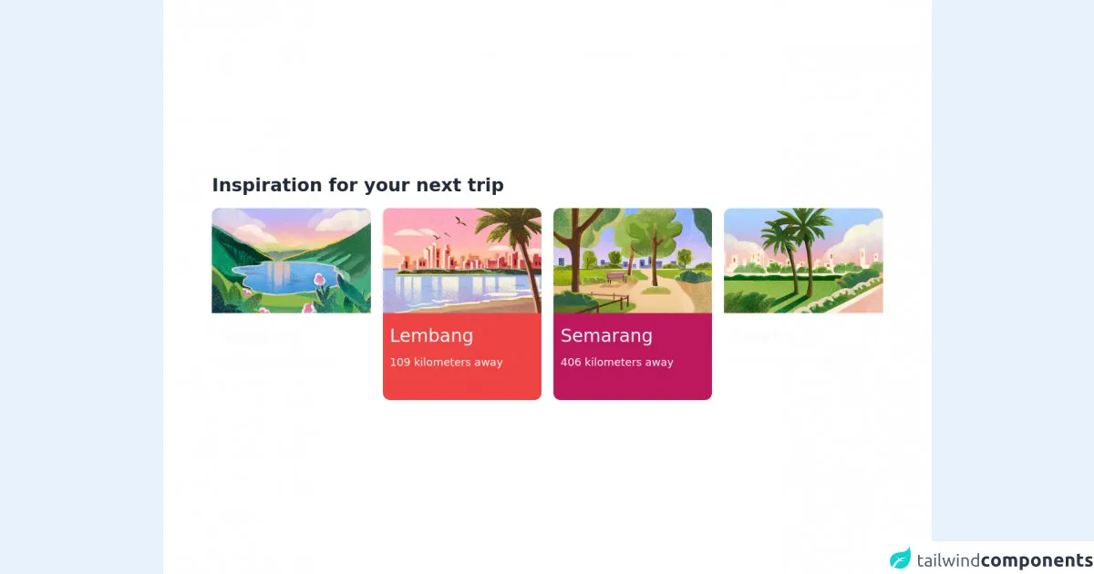
The preview of Airbnb - City Recommendation Card ui component
To create a Airbnb - City Recommendation Card with Tailwind CSS, we will use a combination of pre-defined utility classes to style the component. The component will include a background image of the city, the name of the city, and some information about the city.
Free download of the Airbnb - City Recommendation Card's source code
The source code of Airbnb - City Recommendation Card ui component
To create the Airbnb - City Recommendation Card with Tailwind CSS, we will use HTML and CSS code. The HTML code will define the structure of the component, while the CSS code will apply the styles using Tailwind CSS utility classes.
<div class="flex h-screen items-center justify-center bg-white">
  <div class="px-18 grid grid-cols-12 gap-5">
    <div class="col-span-12">
      <p class="text-3xl font-semibold text-gray-800">Inspiration for your next trip</p>
    </div>

    <!-- Card 1 -->
    <a class="col-span-3 h-52 rounded-xl bg-rose-700 md:h-80" href="">
      <!-- Image -->
      <img
        src="https://a0.muscache.com/im/pictures/a433b4d0-8183-4523-b4c5-99b81c5729c1.jpg?im_w=320"
        class="max-h-44 rounded-t-xl"
      />

      <!-- City Name -->
      <p class="pt-5 pl-3 text-xl text-gray-50 md:text-3xl">Bandung</p>

      <!-- Distance -->
      <p class="pt-3 pl-3 pb-10 text-xs font-light text-gray-50 md:text-lg">117 kilometers away</p>
    </a>

    <!-- Card 2 -->
    <a class="col-span-3 h-52 rounded-xl bg-red-500 md:h-80" href="">
      <!-- Image -->
      <img
        src="https://a0.muscache.com/im/pictures/db8167f7-5c57-4684-80ae-4350c73e45ef.jpg?im_w=320"
        class="max-h-44 rounded-t-xl"
      />

      <!-- City Name -->
      <p class="pt-5 pl-3 text-xl text-gray-50 md:text-3xl">Lembang</p>

      <!-- Distance -->
      <p class="pt-3 pl-3 pb-10 text-xs font-light text-gray-50 md:text-lg">109 kilometers away</p>
    </a>

    <!-- Card 3 -->
    <a class="col-span-3 h-52 rounded-xl bg-pink-700 md:h-80" href="">
      <!-- Image -->
      <img
        src="https://a0.muscache.com/im/pictures/ffde0c4b-1889-4d11-bb00-41411d34fdfc.jpg?im_w=320"
        class="max-h-44 rounded-t-xl"
      />

      <!-- City Name -->
      <p class="pt-5 pl-3 text-xl text-gray-50 md:text-3xl">Semarang</p>

      <!-- Distance -->
      <p class="pt-3 pl-3 pb-10 text-xs font-light text-gray-50 md:text-lg">406 kilometers away</p>
    </a>

    <!-- Card 4 -->
    <a class="col-span-3 h-52 rounded-xl bg-rose-600 md:h-80" href="">
      <!-- Image -->
      <img
        src="https://a0.muscache.com/im/pictures/03bb6d0a-5ccb-47e1-83fc-b7ad87e7f8c3.jpg?im_w=320"
        class="max-h-44 rounded-t-xl"
      />

      <!-- City Name -->
      <p class="pt-5 pl-3 text-xl text-gray-50 md:text-3xl">Serang</p>

      <!-- Distance -->
      <p class="pt-3 pl-3 pb-10 text-xs font-light text-gray-50 md:text-lg">78 kilometers away</p>
    </a>
  </div>
</div>
How to create a Airbnb - City Recommendation Card with Tailwind CSS?
To create a Airbnb - City Recommendation Card with Tailwind CSS, follow these steps:
- Create a new HTML file and add the following code to define the structure of the component:
<div class="max-w-md mx-auto bg-white rounded-xl shadow-md overflow-hidden md:max-w-2xl">
  <div class="md:flex">
    <div class="md:flex-shrink-0">
      <img class="h-48 w-full object-cover md:w-48" src="https://source.unsplash.com/featured/?city" alt="city">
    </div>
    <div class="p-8">
      <div class="uppercase tracking-wide text-sm text-indigo-500 font-semibold">City</div>
      <a href="#" class="block mt-1 text-lg leading-tight font-medium text-black hover:underline">City Name</a>
      <p class="mt-2 text-gray-500">Population: 1,000,000</p>
      <p class="mt-2 text-gray-500">Attractions: Lorem ipsum dolor sit amet, consectetur adipiscing elit.</p>
      <p class="mt-2 text-gray-500">Weather: 25°C, sunny</p>
    </div>
  </div>
</div>
- Add the following Tailwind CSS classes to the HTML elements to style the component:
max-w-md: sets the maximum width of the component tomdbreakpoint.mx-auto: centers the component horizontally.bg-white: sets the background color of the component to white.rounded-xl: rounds the corners of the component.shadow-md: adds a shadow effect to the component.overflow-hidden: hides any content that overflows the component.md:max-w-2xl: sets the maximum width of the component to2xlbreakpoint for medium screens and above.md:flex: enables flexbox layout for medium screens and above.md:flex-shrink-0: prevents the image from shrinking on medium screens and above.h-48: sets the height of the image to48pixels.w-full: sets the width of the image to100%.object-cover: scales the image to cover the entire container.p-8: adds padding to the content container.uppercase: converts the text to uppercase.tracking-wide: adds letter-spacing to the text.text-sm: sets the font size tosm.text-indigo-500: sets the text color to indigo.font-semibold: sets the font weight tosemibold.block: makes the link a block element.mt-1: adds margin to the top of the link.text-lg: sets the font size tolg.leading-tight: sets the line-height totight.text-black: sets the text color to black.hover:underline: underlines the link on hover.mt-2: adds margin to the top of the paragraphs.text-gray-500: sets the text color to gray.
Replace the
srcattribute of theimgelement with the URL of the city image.Replace the text content of the
div,a, andpelements with the name of the city, population, attractions, and weather information.Save the HTML file and open it in a web browser to preview the Airbnb - City Recommendation Card.
Conclusion
In this article, we have explored how to use Tailwind CSS to create a Airbnb - City Recommendation Card, a popular UI component used in many travel-related websites. By using pre-defined utility classes, we can quickly style the component and make it responsive and mobile-friendly.
Tailwind CSS is an excellent choice for creating UI components because it allows us to focus on the design and functionality of the component without worrying about writing custom CSS code. We hope that this article has provided you with some insights into how to use Tailwind CSS to create beautiful and functional user interfaces.